Product Design, Mobile
Asana Mobile Tasks
Asana is a multi-platform product that gives users the ability to stay organized, set goals, track progress, and automate their productivity. For my first project working with Asana I would take an early iteration of the mobile task detail and redesign it to improve the user experience.
Original Design
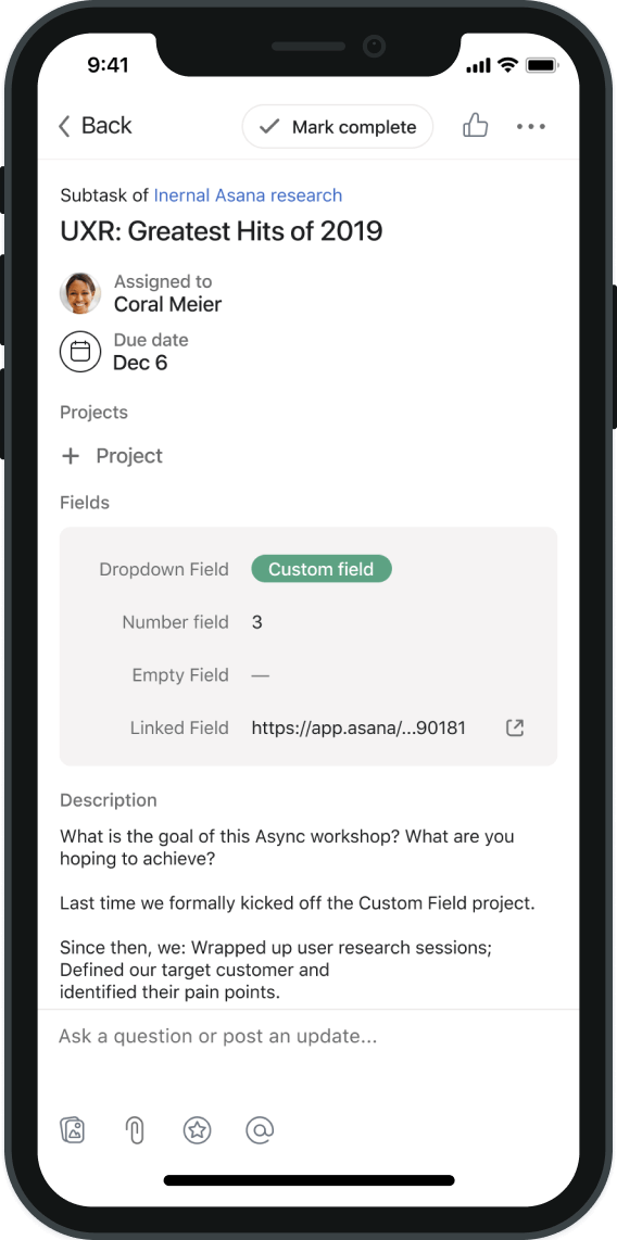
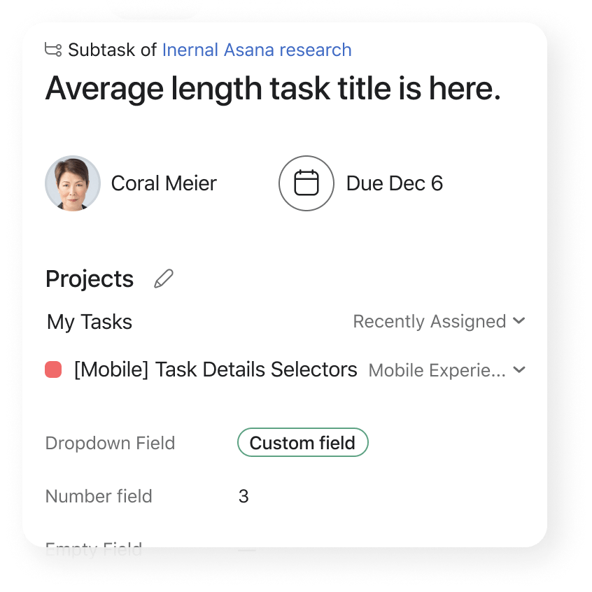
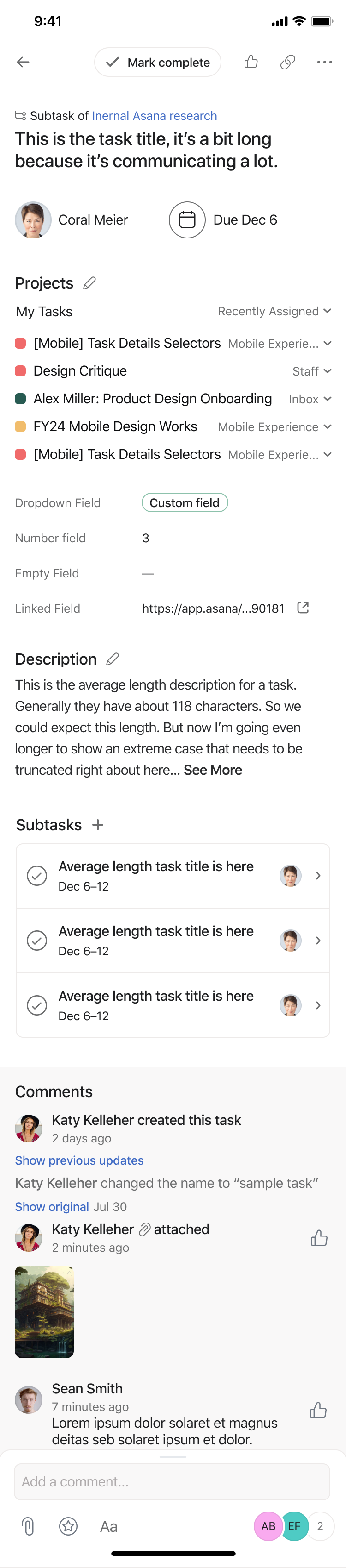
Mobile Task Detail
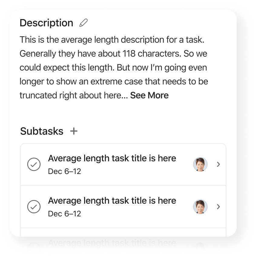
The mobile task detail is the primary surface where users can store information, create actionable items for themselves or others, and can set approvals or engage in conversation. Because the mobile version of Asana is younger than its desktop counterpart it was a more basic design that needed UI unification and improvement.
Key Areas of Focus
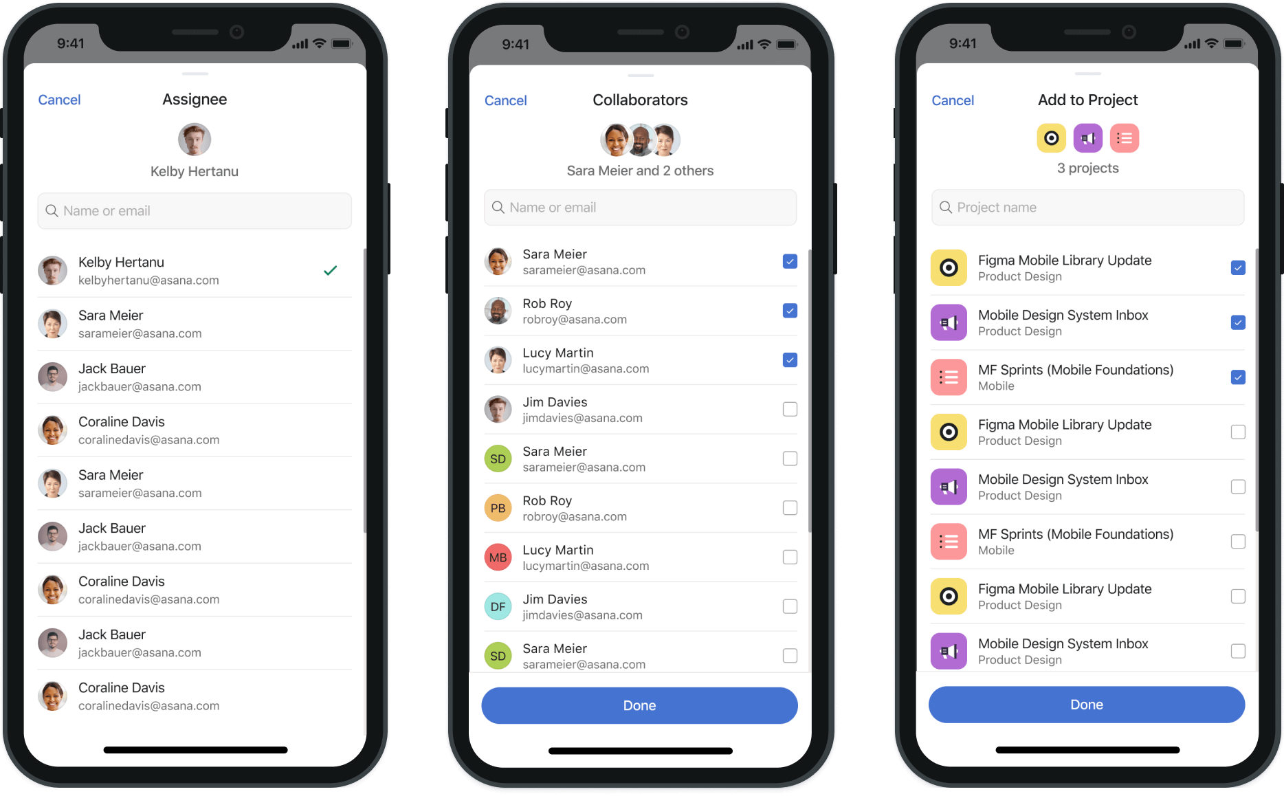
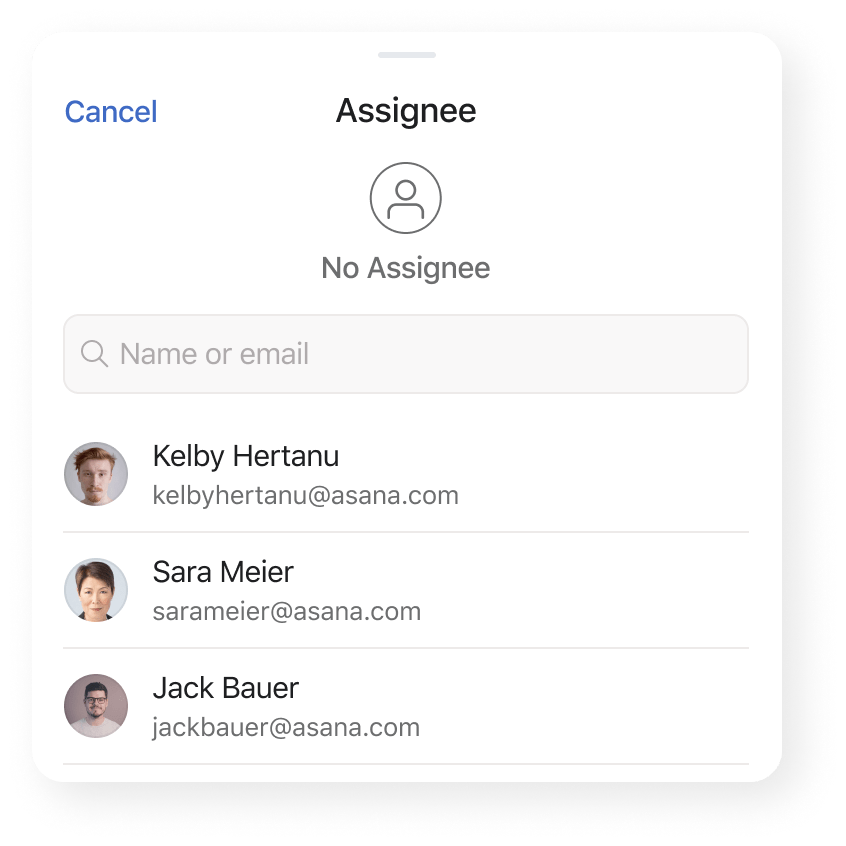
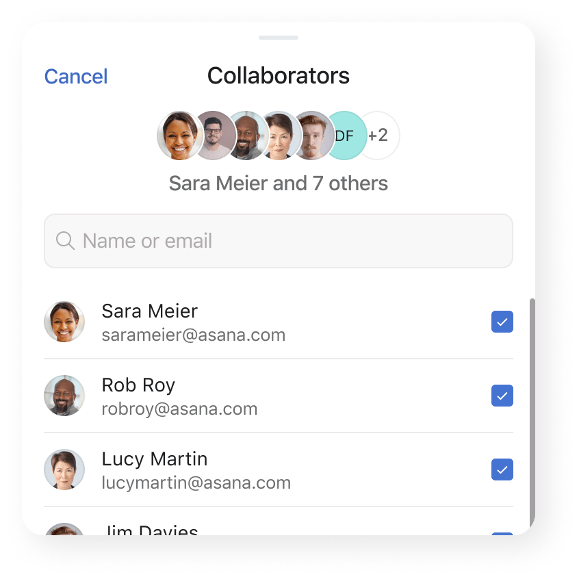
Assignee, Due Date, and Project actions
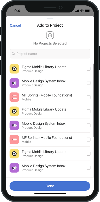
Part One: Task Actions
Asanas task actions had been built at different times and had many issues regarding consistency and quality of user experience. The redesign would address these problems.
Part Two: Task Detail Refresh
The mobile detail page had similar issues, primary focus would be to improve legibility and useability of the page to create a more mobile friendly and cohesive experience.
User Problem
Task actions have limited list display not optimized for mobile to be addressed by implementing a bottom sheet design. Task details feels overwhelming as a mobile experience because of lack of clear heirarchy.
Hypothesis
Implementing improved selectors UI for assignee, collaborators, and projects will improve total metrics for use. Improving the UI design of the task detail will increase mobile traffic.
Design Goals
Improve consistency, legibility, pacing, and create clear actionable CTAs. Reduce the noise by differentiating clearly between sections and conceptualize new UI elements for future iterations.
Task Actions, Before and after
Types of Actions
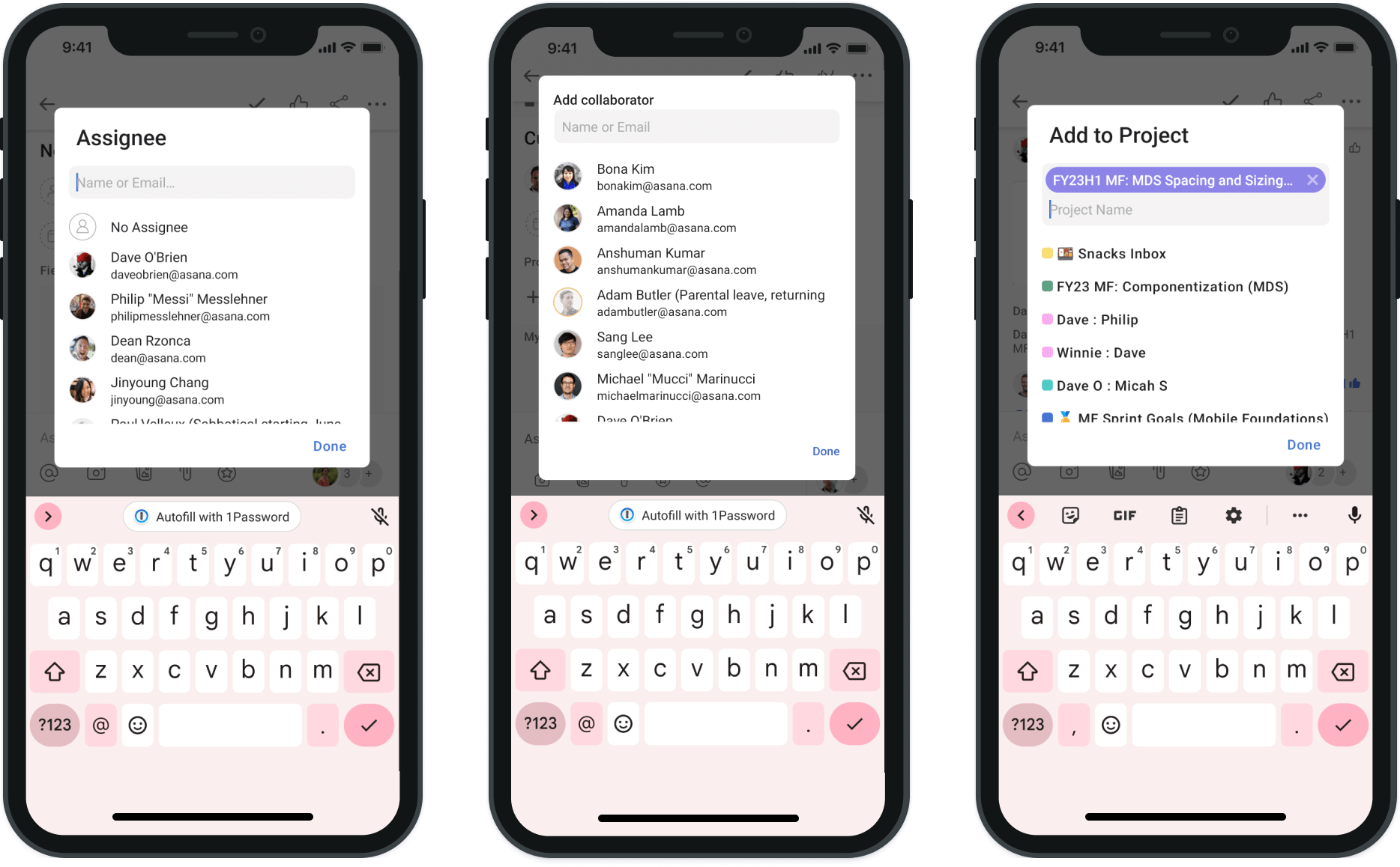
There are three action types we focused on as our primary targets for improvement. Assignee, Collaborators, and Projects. All three actions are triggered from the top area of a task and effect the overall task health.
Assignee
Adding an assignee is essential otherwise tasks have no owner. The previous UI for assigning was confusing for users and inconsistent with other action UI.
Collaborators
Adding collaborators to tasks makes them visible to your team and opens the task up for team members to add resources and communicate with one another.
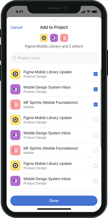
Projects
Adding tasks to projects gives clarity to process stewards allowing them to better plan timelines, resourcing, and track project health across their teams.
Contextual Header
To utilize some of the new real estate created by the bottom sheet designs, a contextual header gives users real time feedback for their selections. The intent is to give users more confidence and reduce accidental selections to increase overall task health.
Results
Assignee and Collaborator actions trending positive with overall activity up and accidental clicks trending down. Projects saw a negative result in multihoming (adding to multiple projects) but decrease in project removals to achieve a net neutral result. Overall traffic in sections increased for positive result.
+13%
Assignees Selected
+10%
Collaborators Added
-40%
Assignees Removed
+4%
Increased Traffic
Task Detail, Before and after
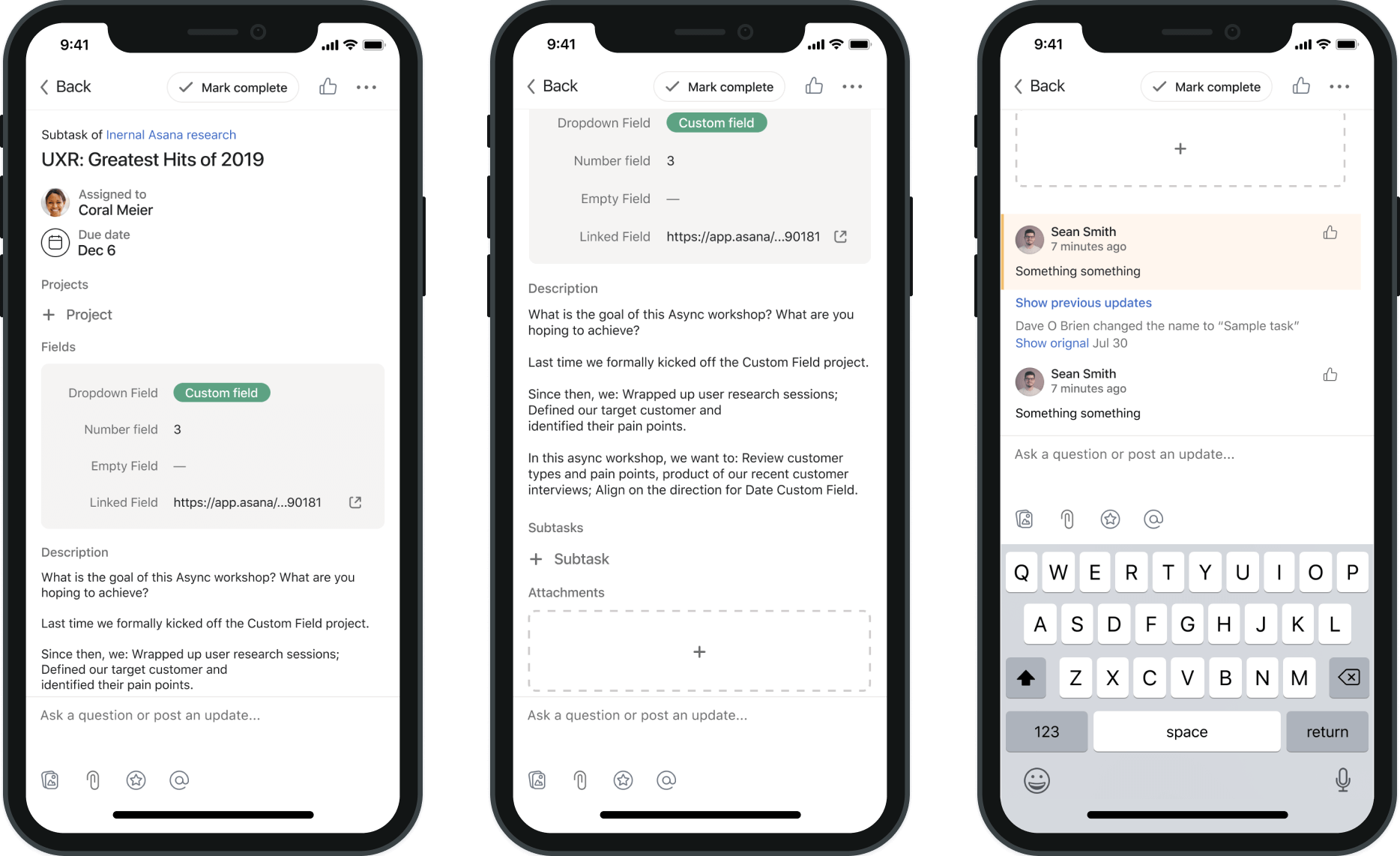
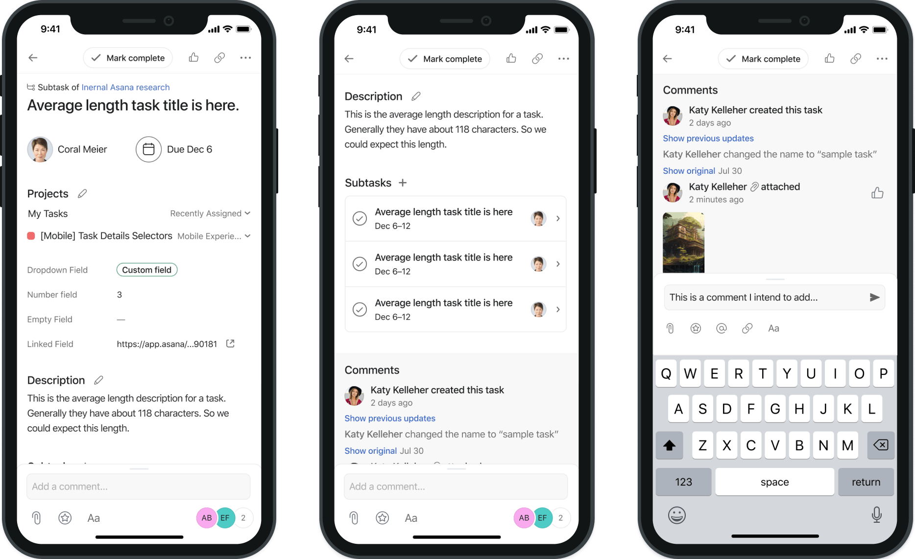
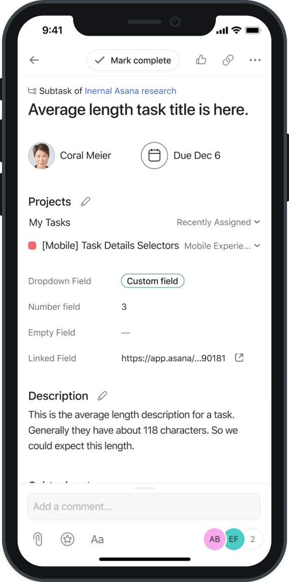
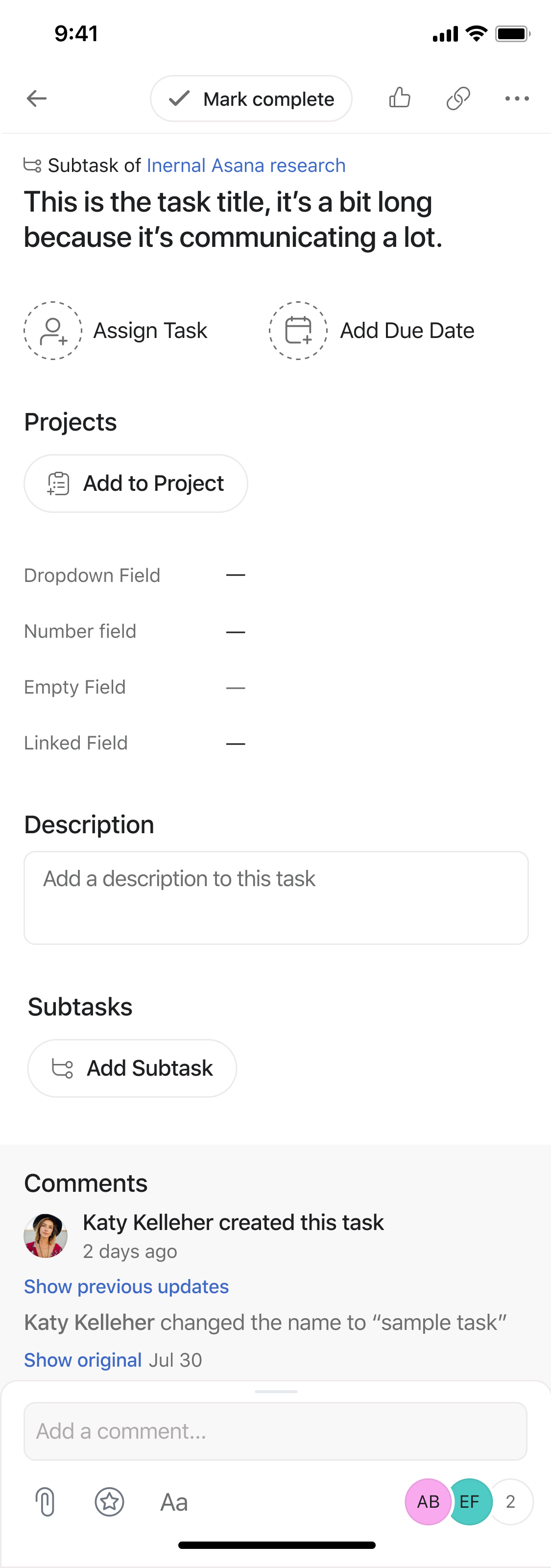
Task Detail Page
Design Spotlight
Updates to type heirarchy, spacing, use of iconography, and creating clear actionable UI differentiates actions and content so users can better understand their tasks. These updates were made in coordination with stystems designers to ensure longevity and scalability.
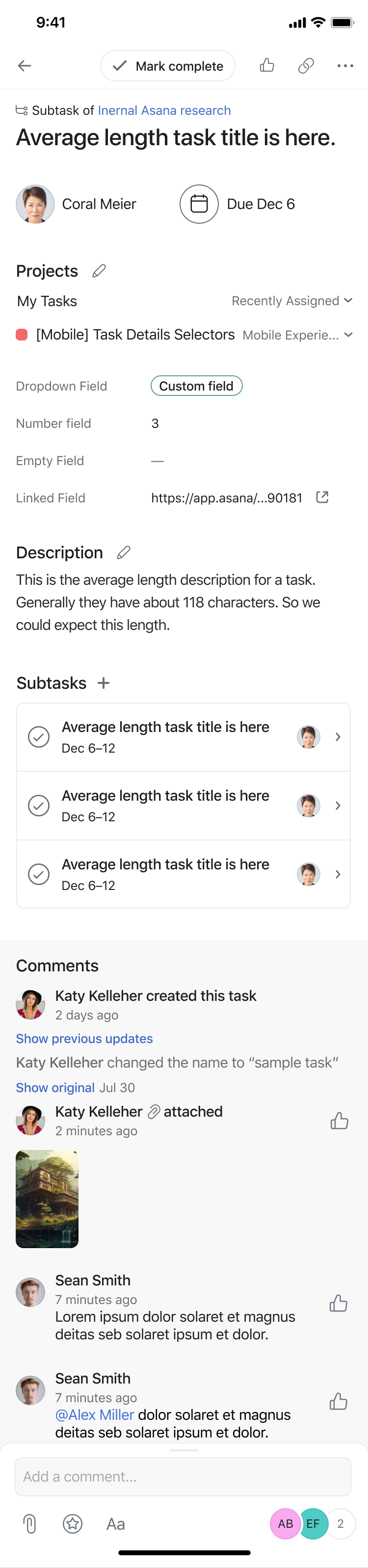
Dynamic Header
Task headers convey the task idea in just a few characters, so in order to punch it up in the heirarchy we utilized dynamic typography that would scale which we based on our most frequent task lengths.
Typography & Scale
Subheadlines were made more obvious and differentiated in style from section content. Body text was increased and adjusted for legibility, and spacing of iconography and content was adjusted.
UI/CTAs
CTA styles were rethought as a whole, starting with more obvious buttons and editable section heads that made actionable items differentiated from wayfinding. Bottom bar streamlined for most important actions.
User Interface Full View
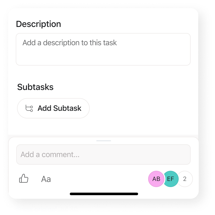
Empty States
Average Content
Dense Content (Rare Cases)
Credits
Credits
Credits
Credits
Thanks to the wonderful team members that helped make this happen.
Teamwork makes the dream work.
Graduated with top portfolio nominations and a Bachelor of Fine Arts degree in Communication Design.