Product Design, Branding, Marketing
Google Primer Brand
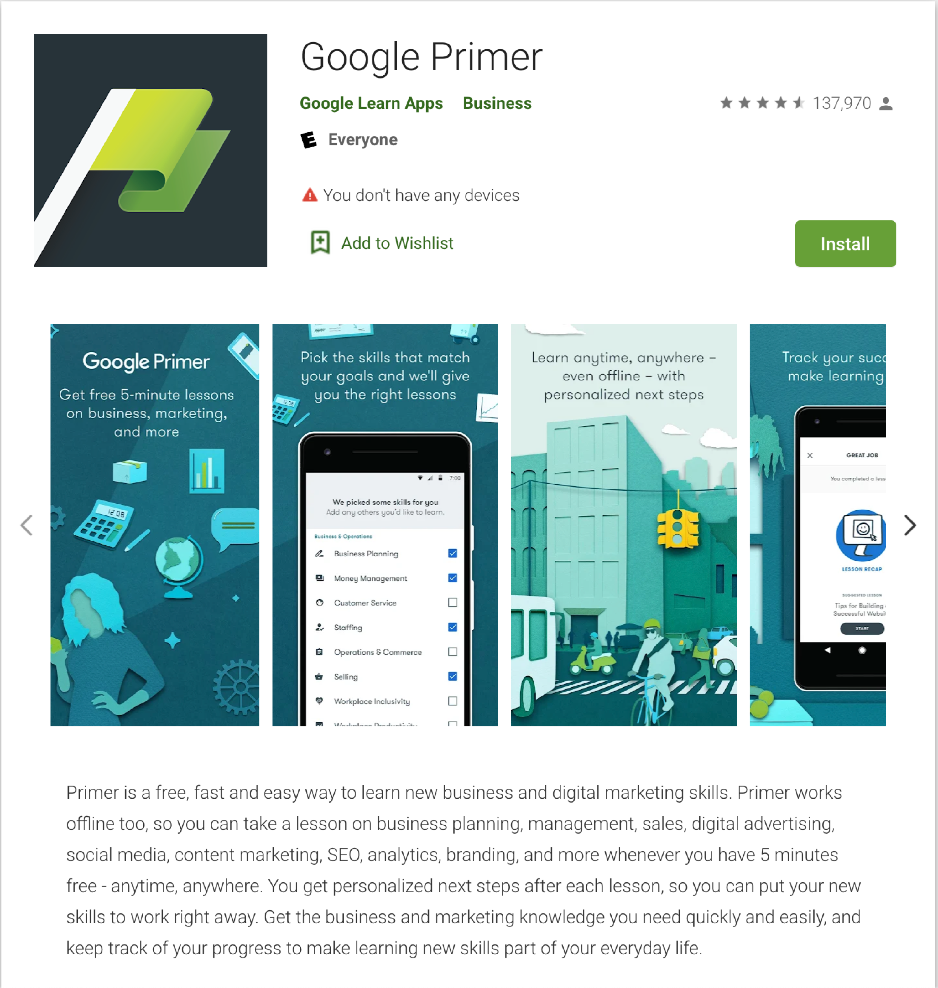
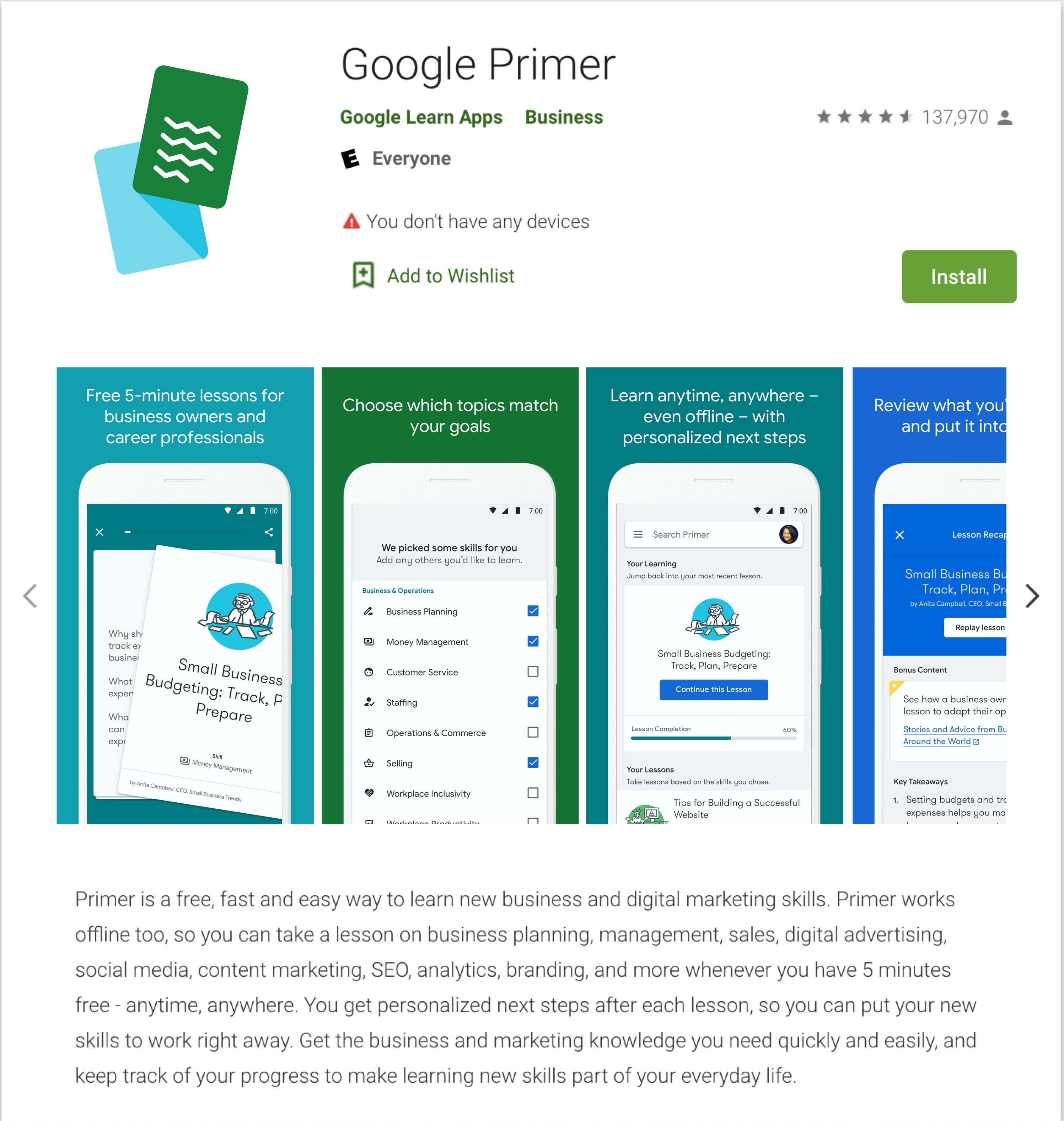
Primer was a free mobile app for users all over the world to learn about business & marketing topics. As a previously independent product, Primer had curated its brand to be light, easy going, and approachable. As it became more popular it was brought closer within the main Google suite, which would prompt a total rebrand of Primer, now Google Primer.
The Mission
Adapt the Primer brand to match Google without losing Primer's identity.
Logo
Primer Classic
The original Primer logo was designed for a much older version of the app based on concepts that were long since left behind. Showing its age, and not relating to the function and purpose of the app any longer, it would need a total conceptual and visual overhaul. To accomplish this we would put the logo through a competitive audit, an internal comparison with other google products, visual and conceptual design, and then we would pressure test it before launching a new Google Primer.
New Primer
Google Primer is about learning — users would be able to consume information related to their desired skills in a number of ways, but the primary learning device was swipeable cards. Through several emerging concepts the most literal was declared champion. It clearly communicates the purpose of Primer, while its form suggests action, a bit of playfulness, all within the design language of other Google products.
Google Material Brand Standards
The concept of the product should be clear from its icon. Avoid complicated designs or confusing metaphors.
Final 2 Concepts
Final 2 Concepts
Final 2 Concepts
The Primer flag re-imagined, no longer a starting point but instead a goal to be achieved. The flag now rests atop an implied pedestal that sits within the counter of the P.
Simple and straight forward, yet playful. This concept demonstrates the function and purpose of the app and communicates the idea of learning at a glance.
Look & Feel
Re-designing color, form, illustration, & typography to re-assemble the new user interface design.
Color
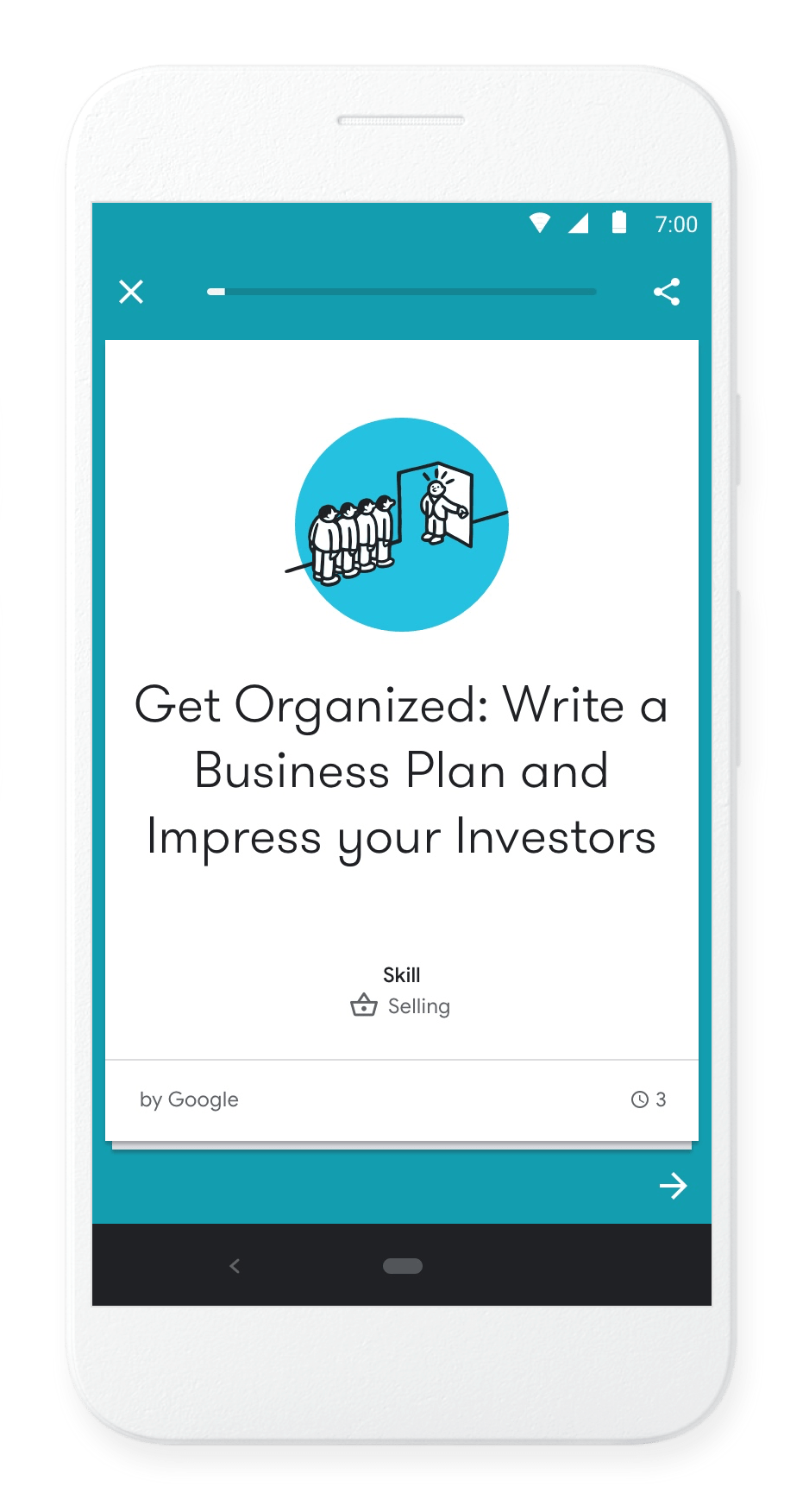
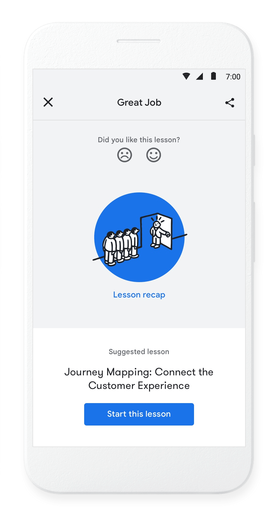
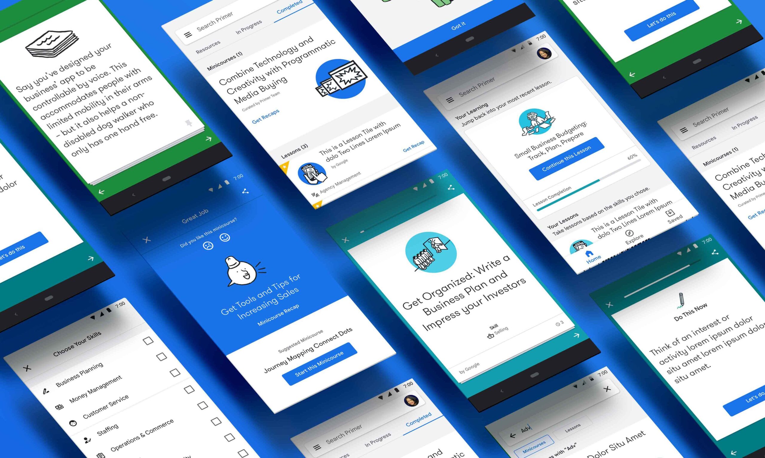
Color is an essential building block of any design system that requires care to make sure that it communicates the right information to users in a way that is creative and accessible. In Primer, color is used across lessons, illustrations, UI, and is used at a macro level as a sense of wayfinding for users. Different lesson types are combined into different color categories and completed lessons are marked in the Google royal blue.
Illustration
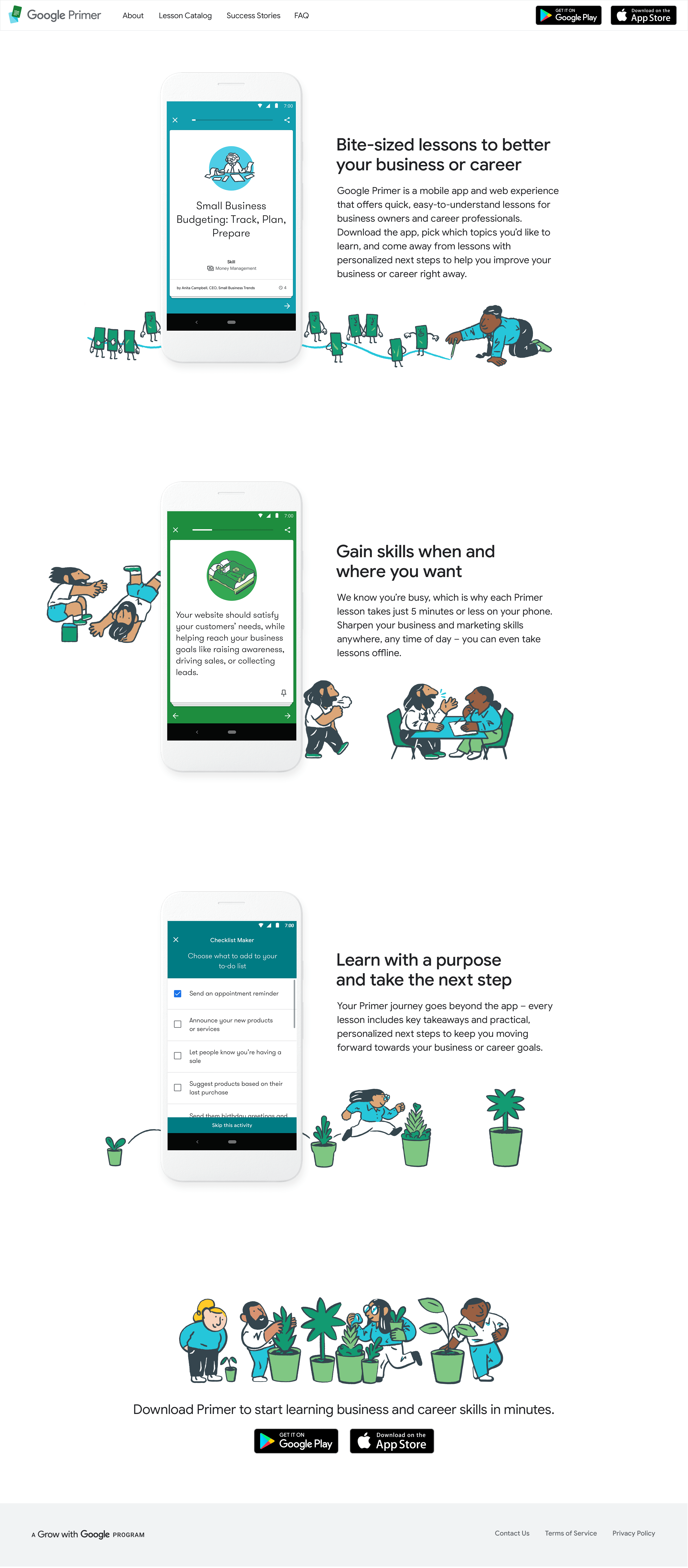
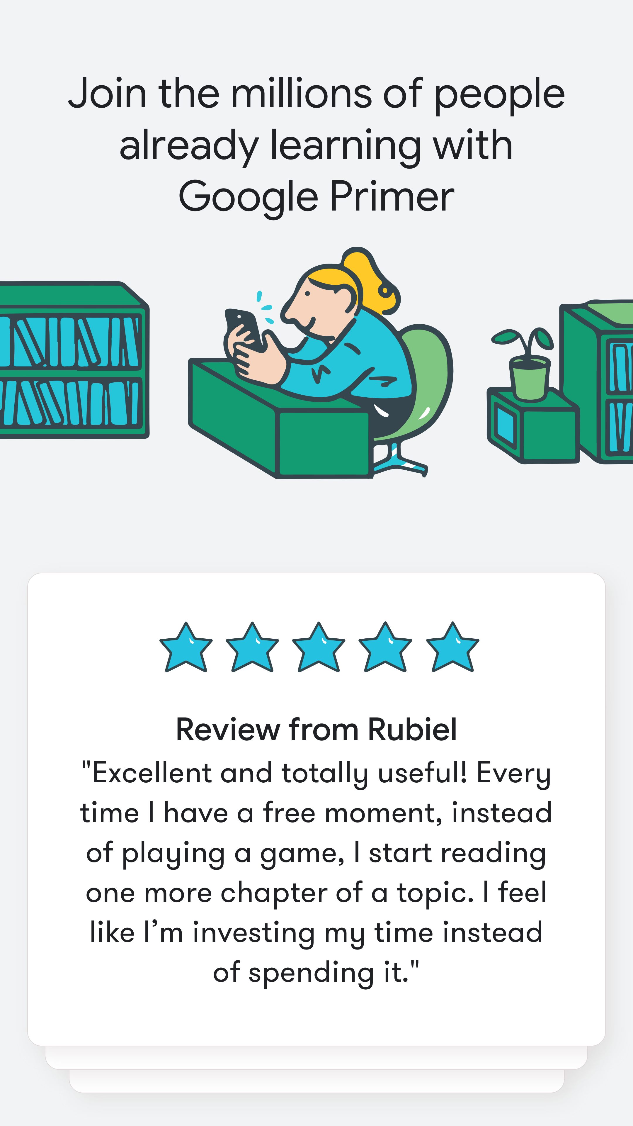
Like color the use of illustration is varied and thoughtful. Illustrations are broken down into two types: In-Lesson, and Out-of-Lesson. In app illustrations follow the core Primer palette, using more whimsical application of blues and greens, whereas the Out-of-Lesson illustration which is used in marketing materials, social, onboarding, etc. would implement natural skin tones. The Out-of-Lesson illustration was often more natural and less fantastical, so the use of natural skin tones was more appropriate. It also created a separation between the marketing and the app which felt like a digital port hole that changed the illustration look to something more replicable and less realistic.
One key update to the Primer palette and color system would be the addition of realistic skin tones for illustrations existing outside of lessons. Our marketing materials use these illustrations to promote the product and offered up a great opportunity to take a slightly more realistic approach while keeping the lesson illustrations more fantastical and whimsical in nature.
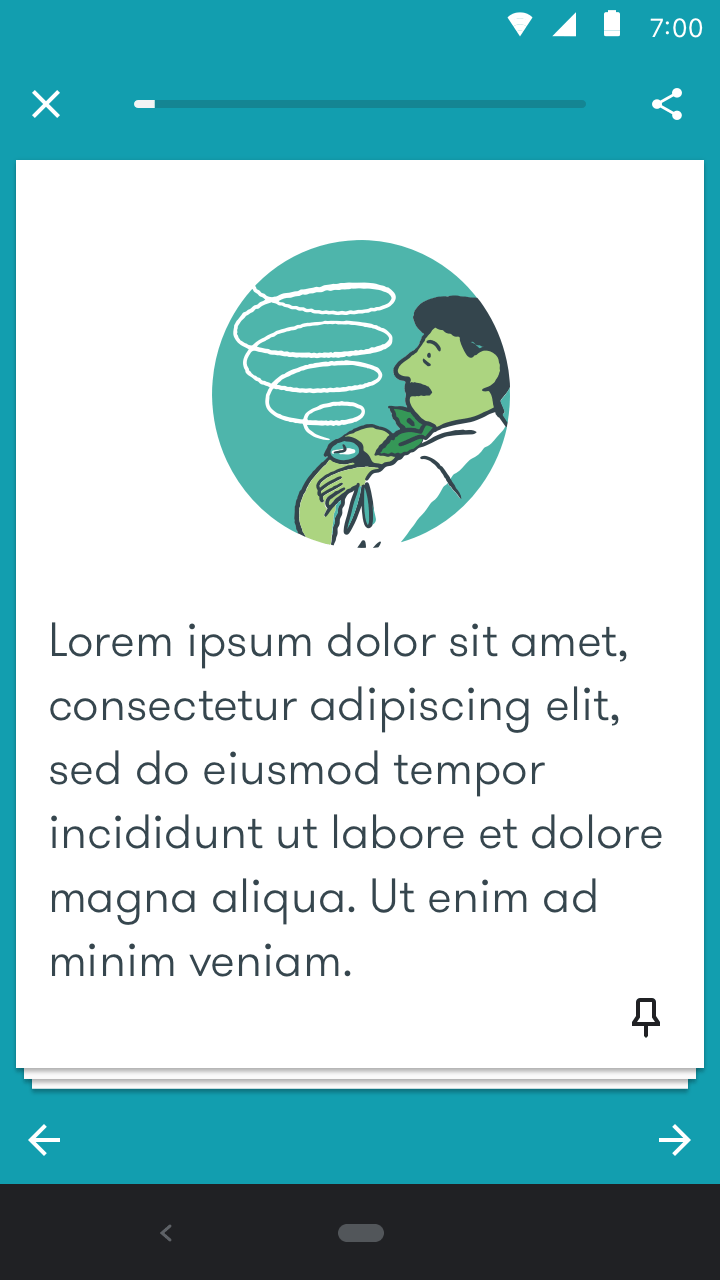
In-Lesson Illustration
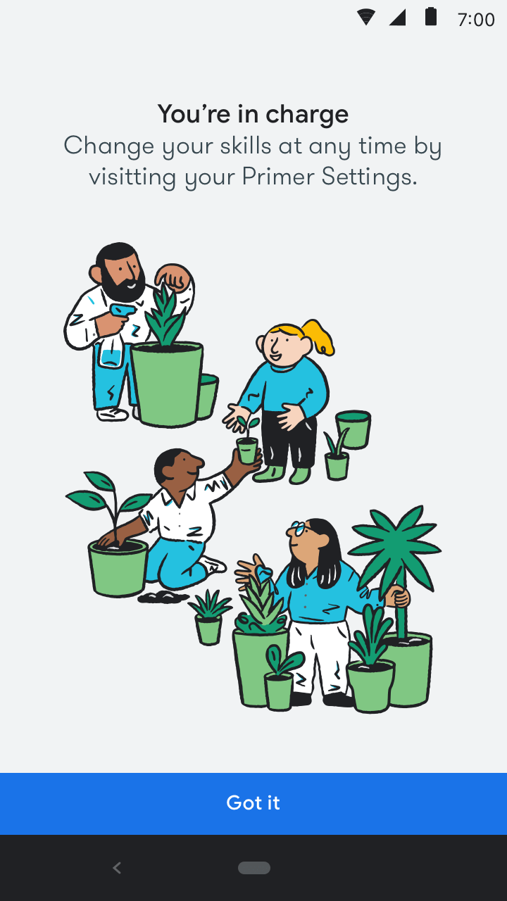
Out-of-Lesson Illustration
Typography
GT Walslheim
Google Sans
Marketing
Website
Website
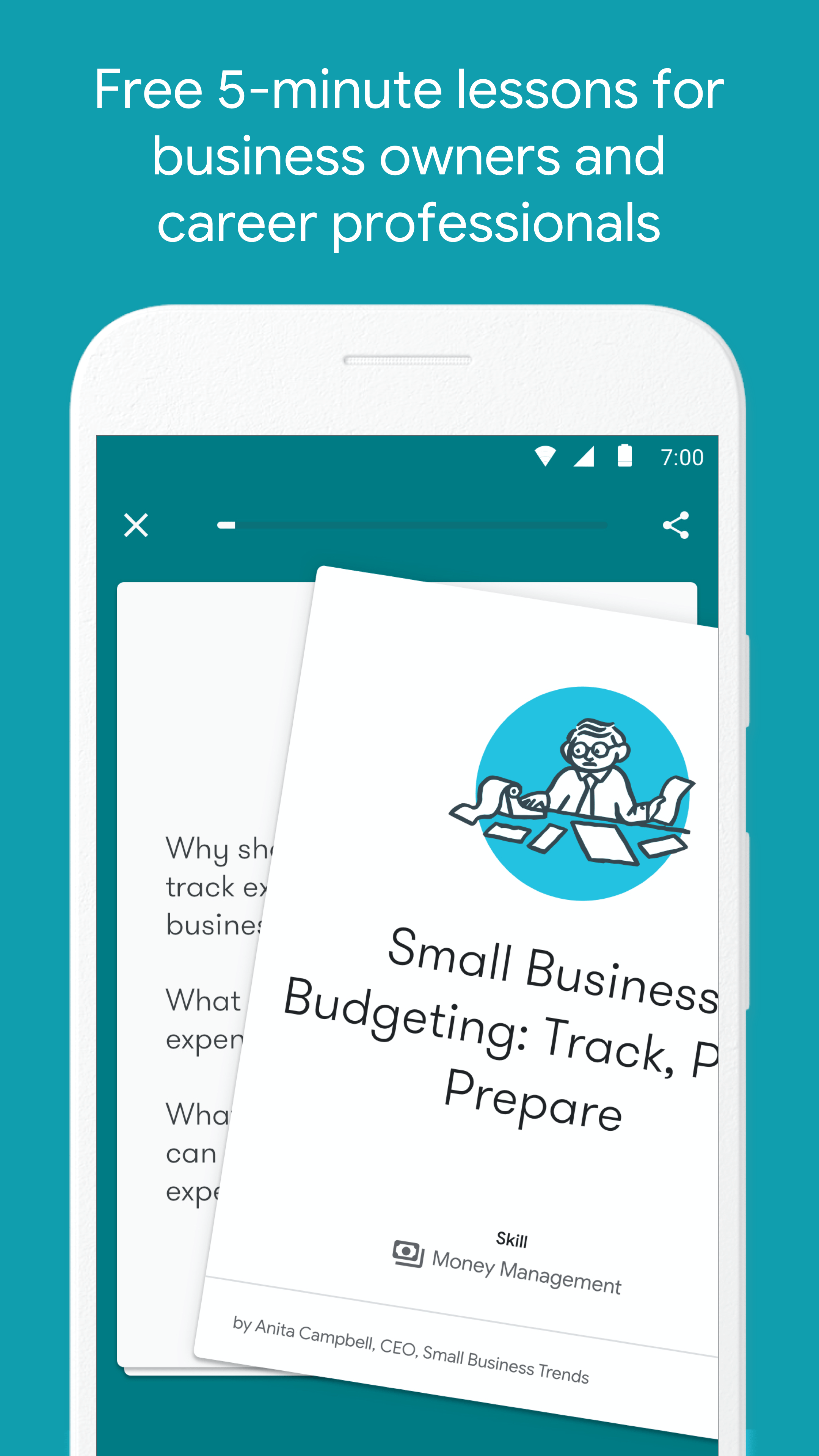
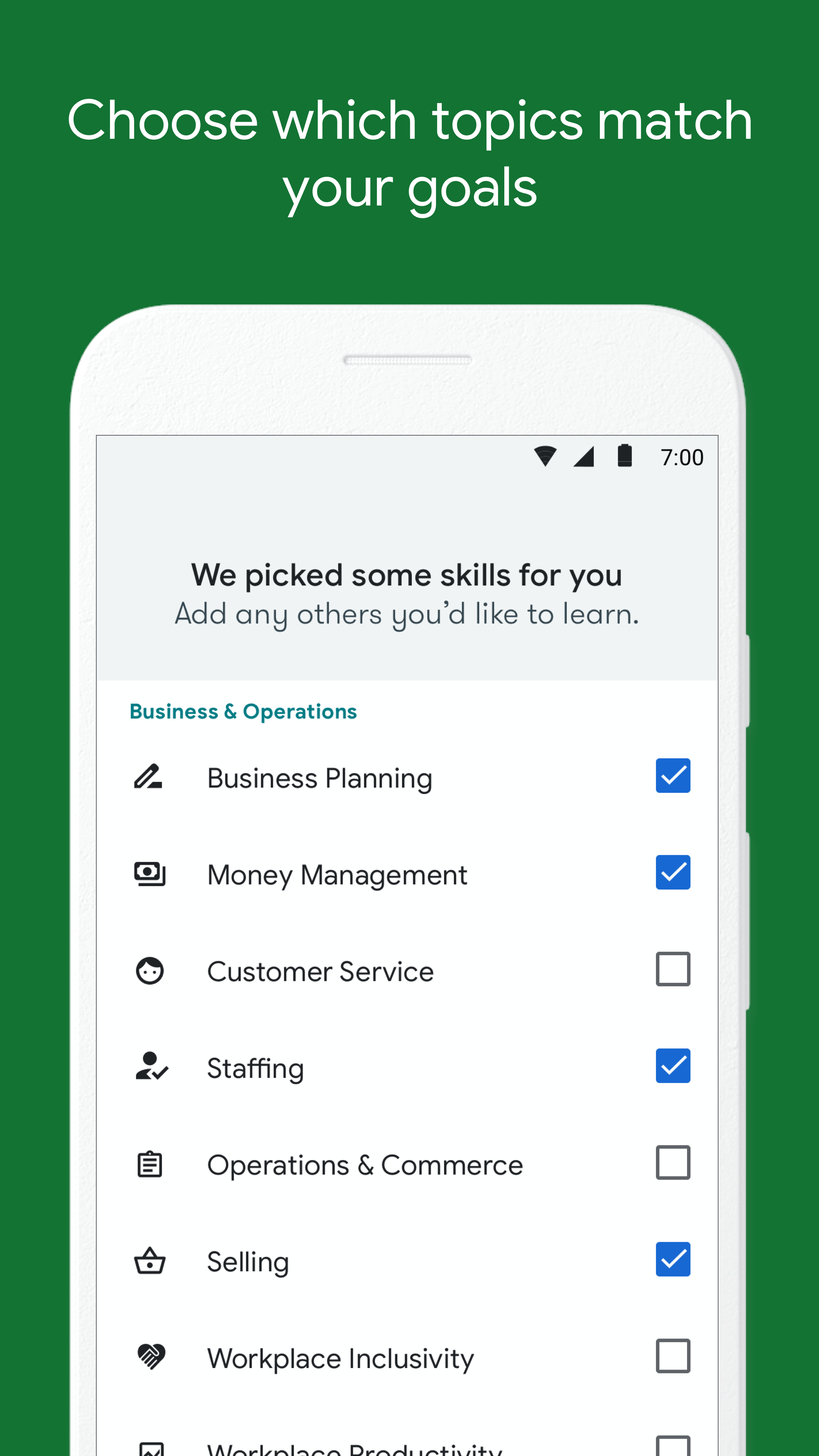
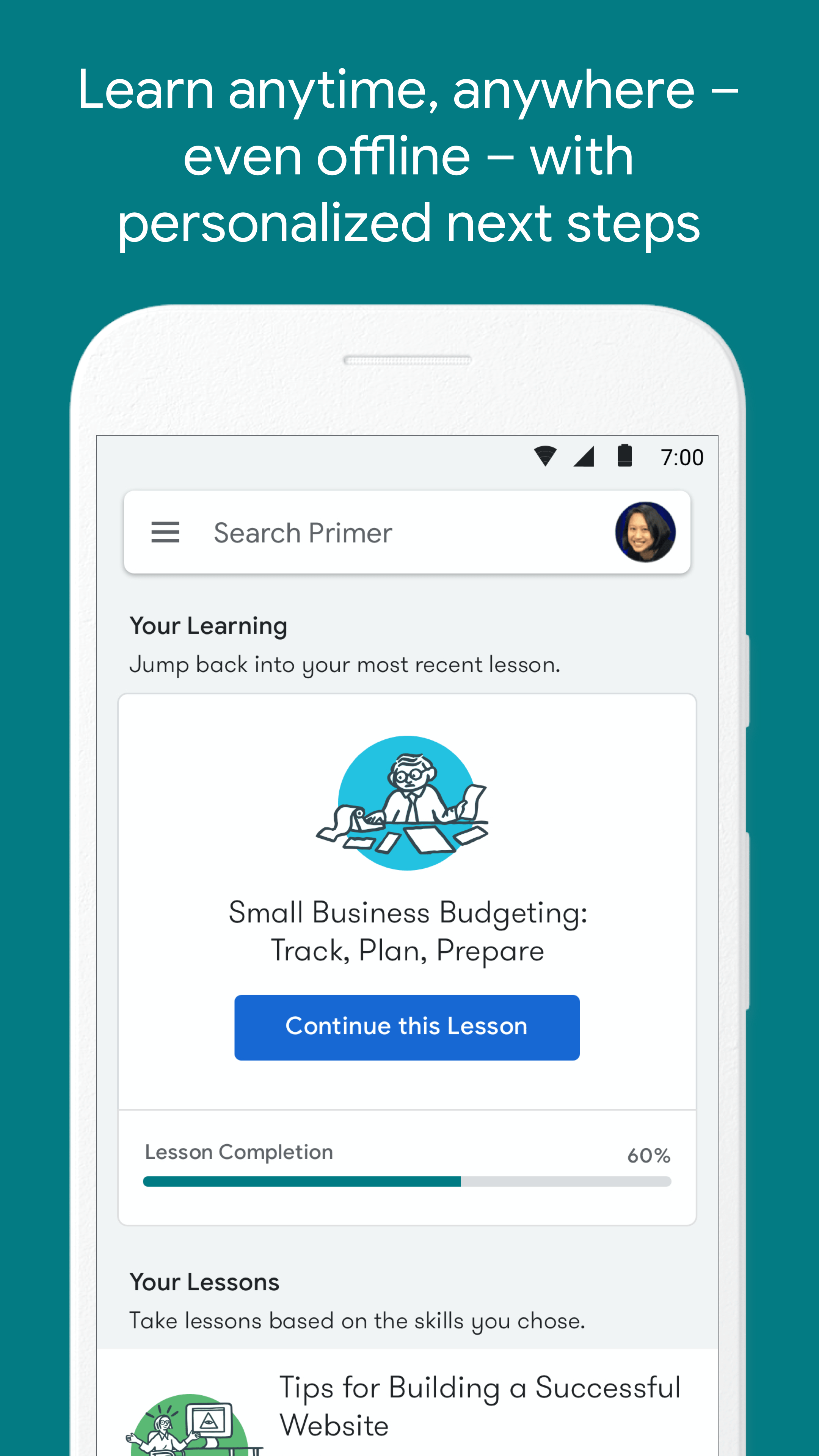
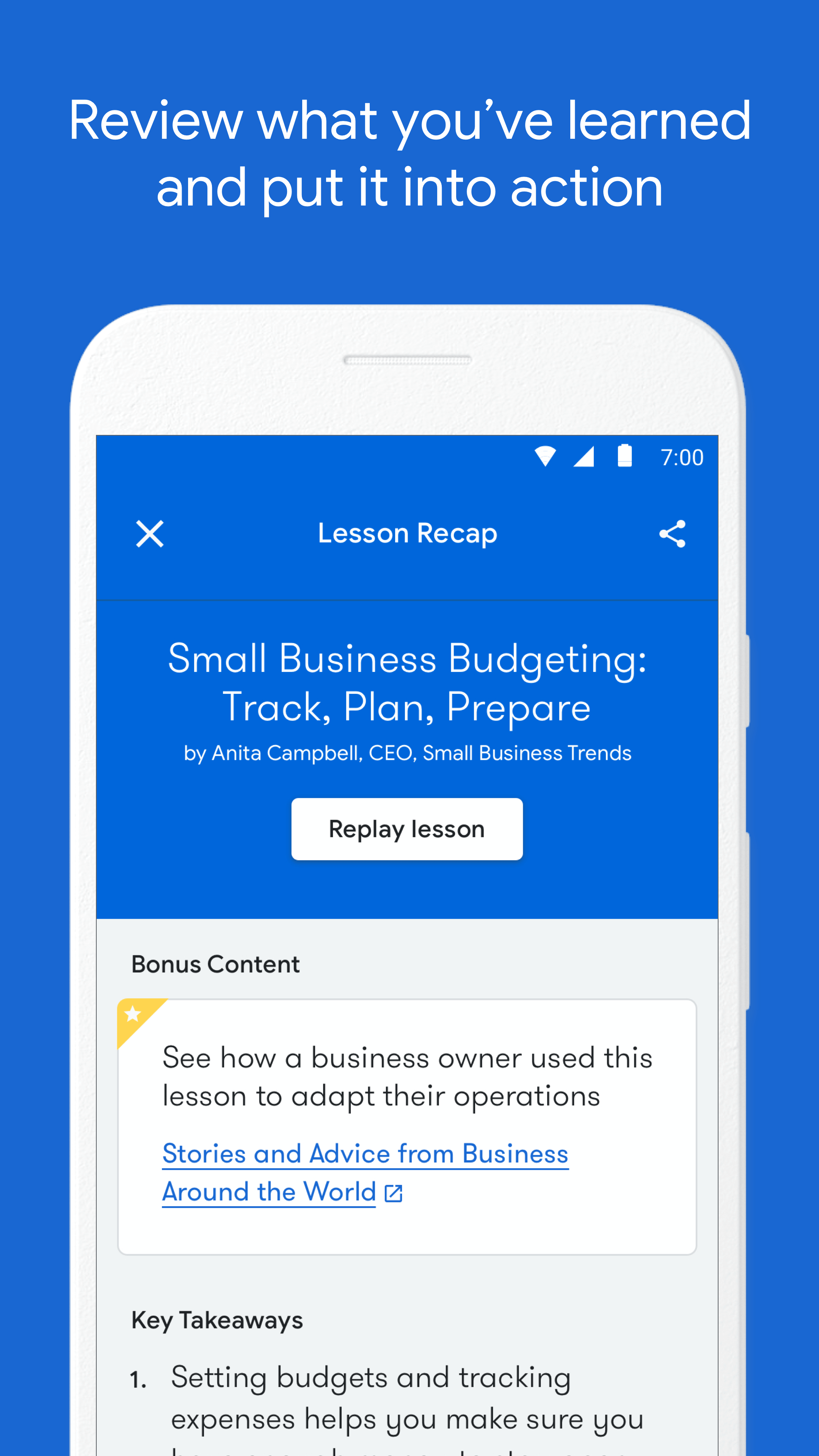
App & Play Store
Stores
Stores
Stores
Before
After

Emails
Marketing Materials
Marketing
Marketing
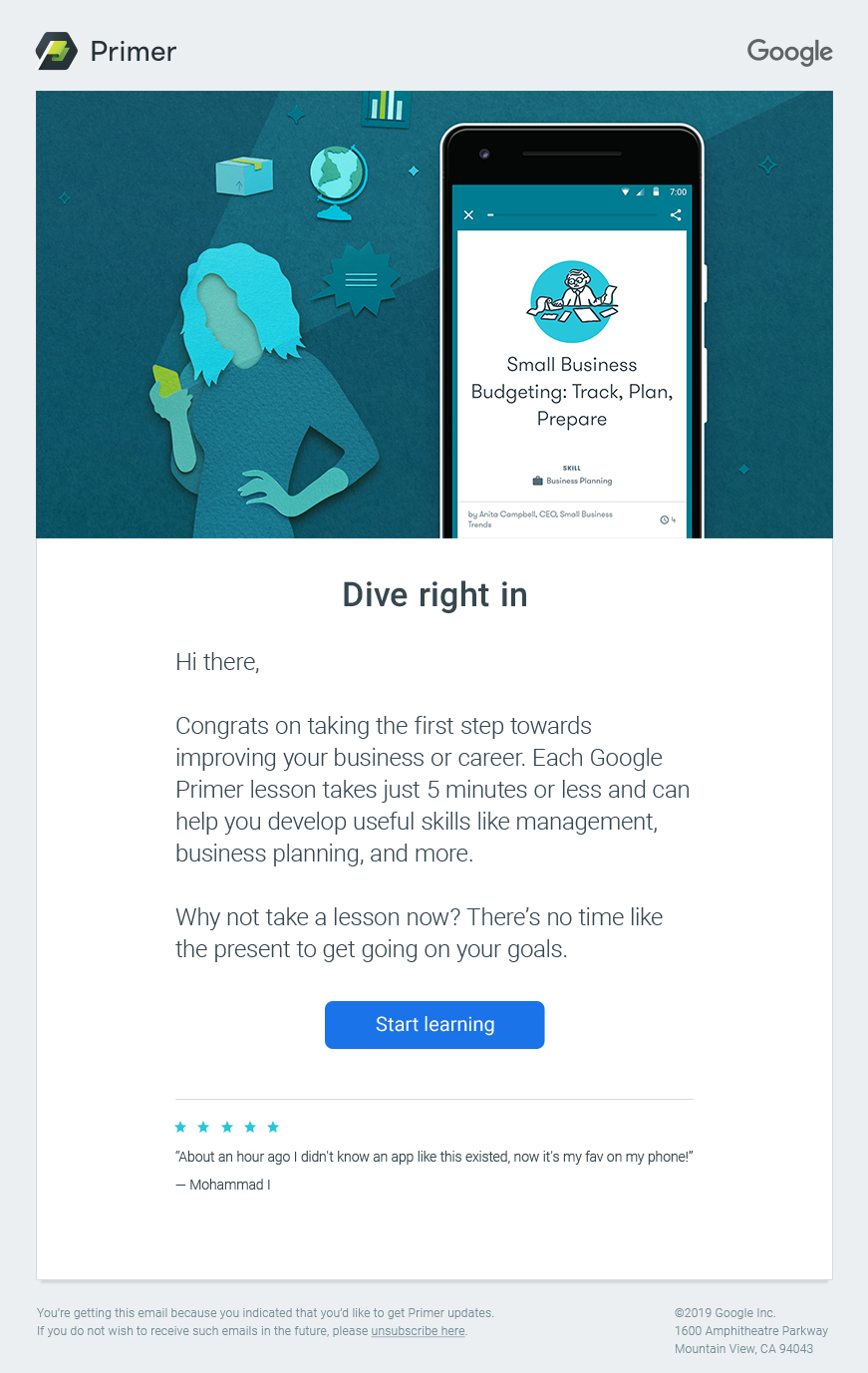
Before
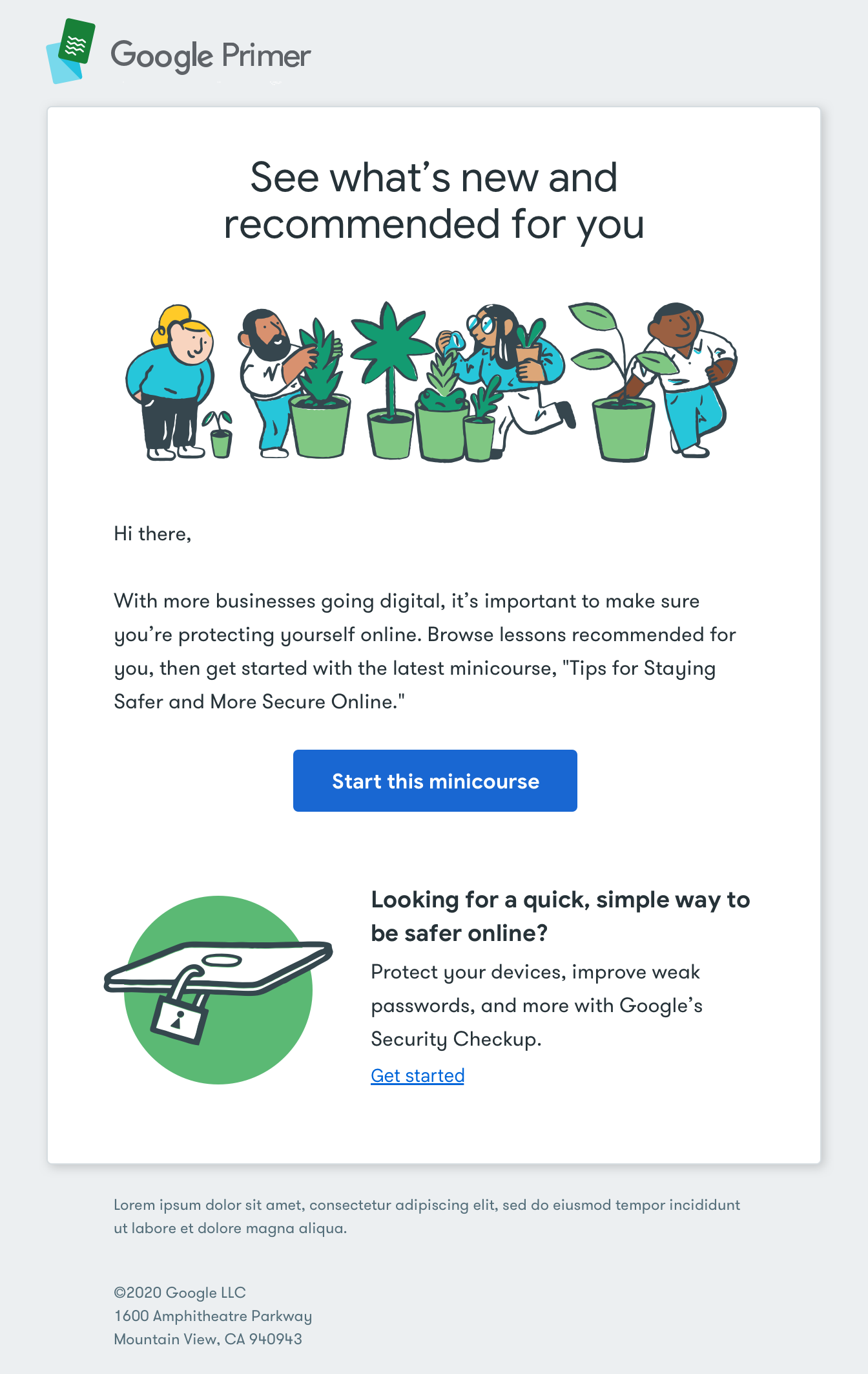
After
Credits
Credits
Credits
Credits
There's no I in rebrand, here's the team that made it happen.
There's no I in rebrand, here's the all-star roster.
Graduated with top portfolio nominations and a Bachelor of Fine Arts degree in Communication Design.