UI/UX, Art Direction
General Assembly
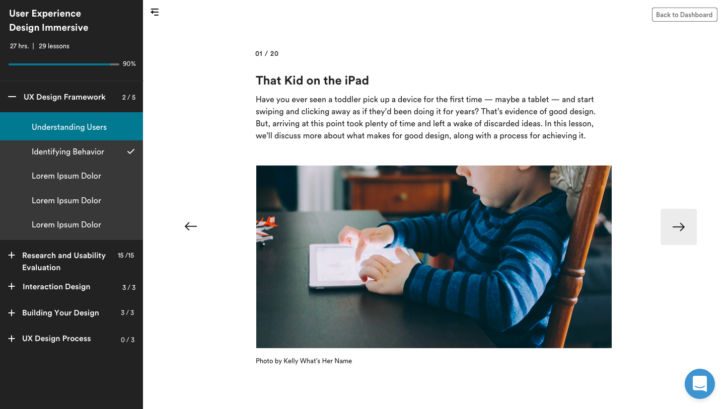
General Assembly is a school for UXD, project management, marketing, and development. My role as primary visual designer on the product team involved unifying and evolving the brand and applying it to the online learning platform to create a more cohesive and dynamic experience.
Design Timeline
1
Discovery
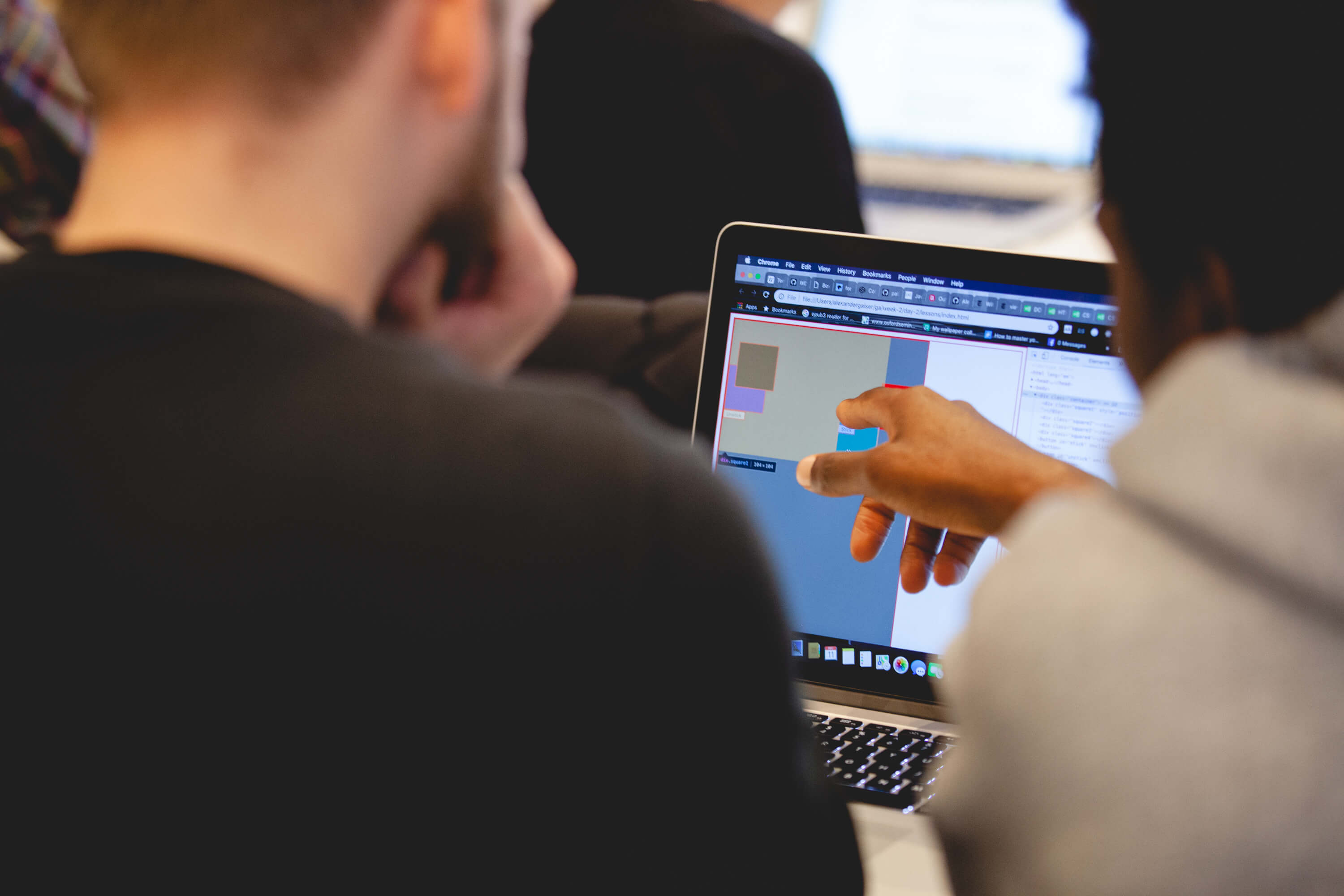
Beginning with a series of tests on employees, students, and professors would provide insights to inform the design process and determine what elements of the brand resonated best with users.
2
Design Exploration
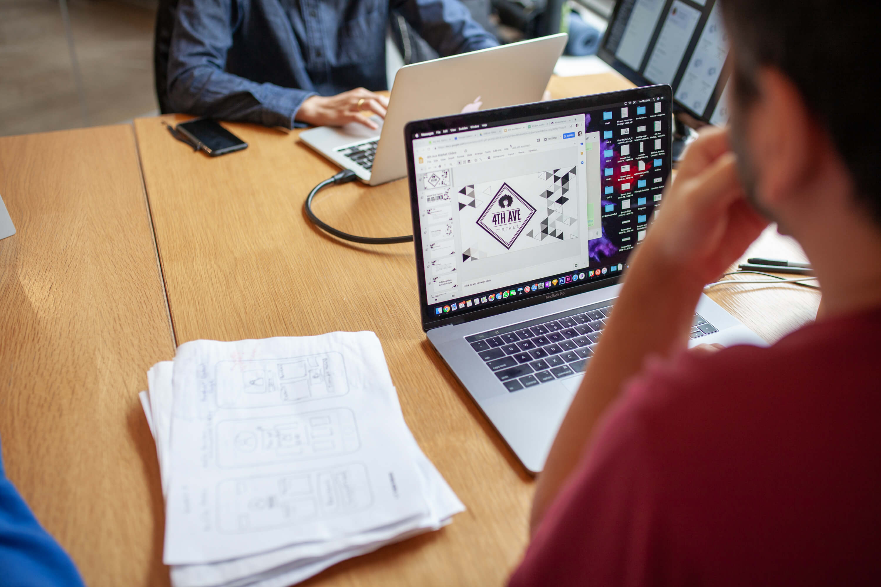
Using the testing data as a waypoint, we would then explore countless design iterations (pictured above/below) to improve the UX and visual design with an emphasis on motion and a desire to incorporate themes from the physical spaces.
3
Implementation
These findings quickly went from conceptual to practical in update to the way users would take lessons on the platform. The introduction of a new navigation structure, motion design elements, UI improvements, and a redesign of the lesson structure would combine all the ideas that we had tested over the previous months.
Motion
Feature Updates
Feature Updates
Feature Updates
Feature Updates
You've got to start somewhere...
You've got to start somewhere...
As a first step, simple page load animations were added as a sort of low hanging fruit introduction to animation. This would cover a lot of ground quickly, and was also an easy implementation step to get the ball rolling.
As a first step, simple page load animations were added as a sort of low hanging fruit introduction to animation. This would cover a lot of ground quickly, and was also an easy implementation step to get the ball rolling.

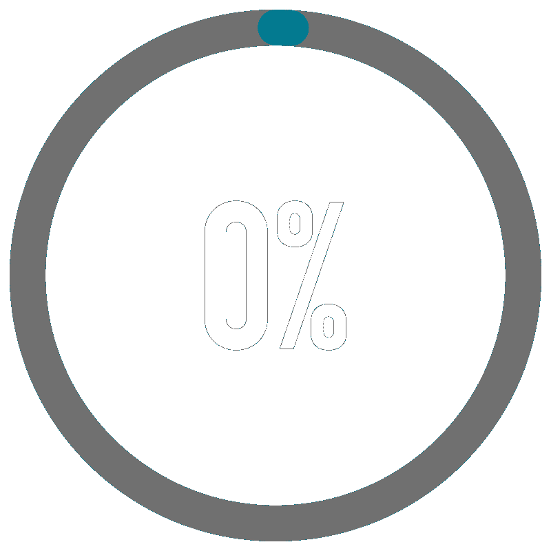
Getting creative with data backed patterns.
Getting creative with data backed patterns.
Elements like dynamic value changes would add meaninful motion that would sweep across the platform. It would provide a visual progress cue for users that would take place in a number of areas on the platform. This was a strategic introduction backed by data that would make a big difference.
Functional animation for meaningful movement.
Functional animation for meaningful movement.
Dynamic value change was the first step to the functional animation concept. How could we encourage our users with even the simplest UI animations, the direction of our button animations or a page transition? I started to create rules for animation as encouragement. Simple ideas that could hopefully subconciously influence the users to progress forward.
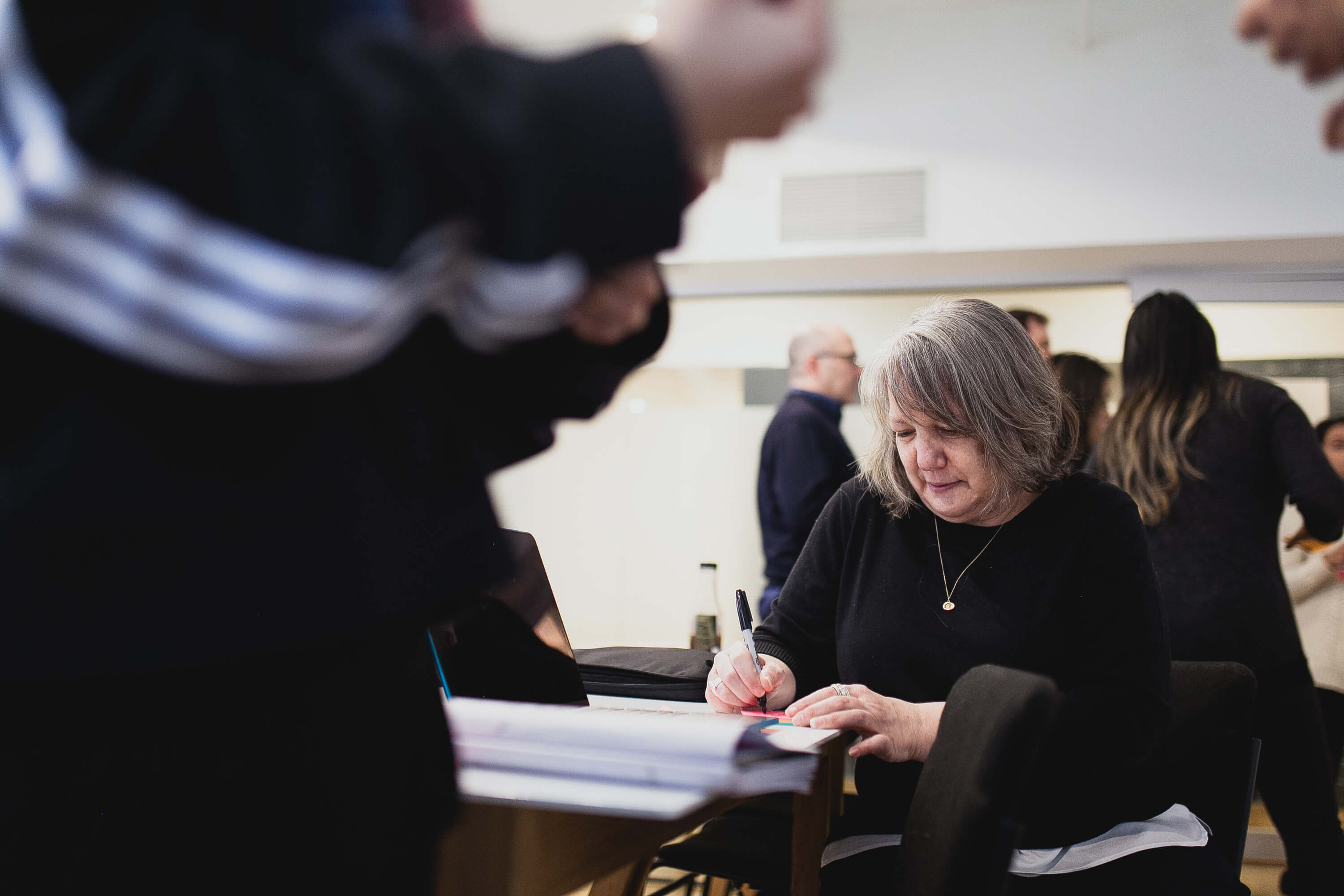
Photography
Photography
Photography
Having multiple campuses in locations all over the globe is great growth for a young company but it also poses consistency issues for marketing materials and online learning. As an initiative to slim down and refine the branding I audited and tested existing image assets and used that to create a standard for future asset development. To put it into practice I produced and art directed a series of photoshoots to use in the refresh.
Having multiple campuses in locations all over the globe is great growth for a young company but it also poses consistency issues for marketing materials and online learning. As an initiative to slim down and refine the branding I audited and tested existing image assets and used that to create a standard for future asset development. To put it into practice I produced and art directed a series of photoshoots to use in the refresh.
Having multiple campuses in locations all over the globe is great growth for a young company but it also poses consistency issues for marketing materials and online learning. As an initiative to slim down and refine the branding I audited and tested existing image assets and used that to create a standard for future asset development. To put it into practice I produced and art directed a series of photoshoots to use in the refresh.

Sidebar
Feature Update: Sidebar
Sidebar
The introduction of the sidebar navigation would give users the ability to quickly move through courses in a way that previously wasn't available to them.
The introduction of the sidebar navigation would give users the ability to quickly move through courses in a way that previously wasn't available to them.
The introduction of the sidebar navigation would give users the ability to quickly move through courses in a way that previously wasn't available to them.
The introduction of the sidebar navigation would give users the ability to quickly move through courses in a way that previously wasn't available to them.
The introduction of the sidebar navigation would give users the ability to quickly move through courses in a way that previously wasn't available to them.
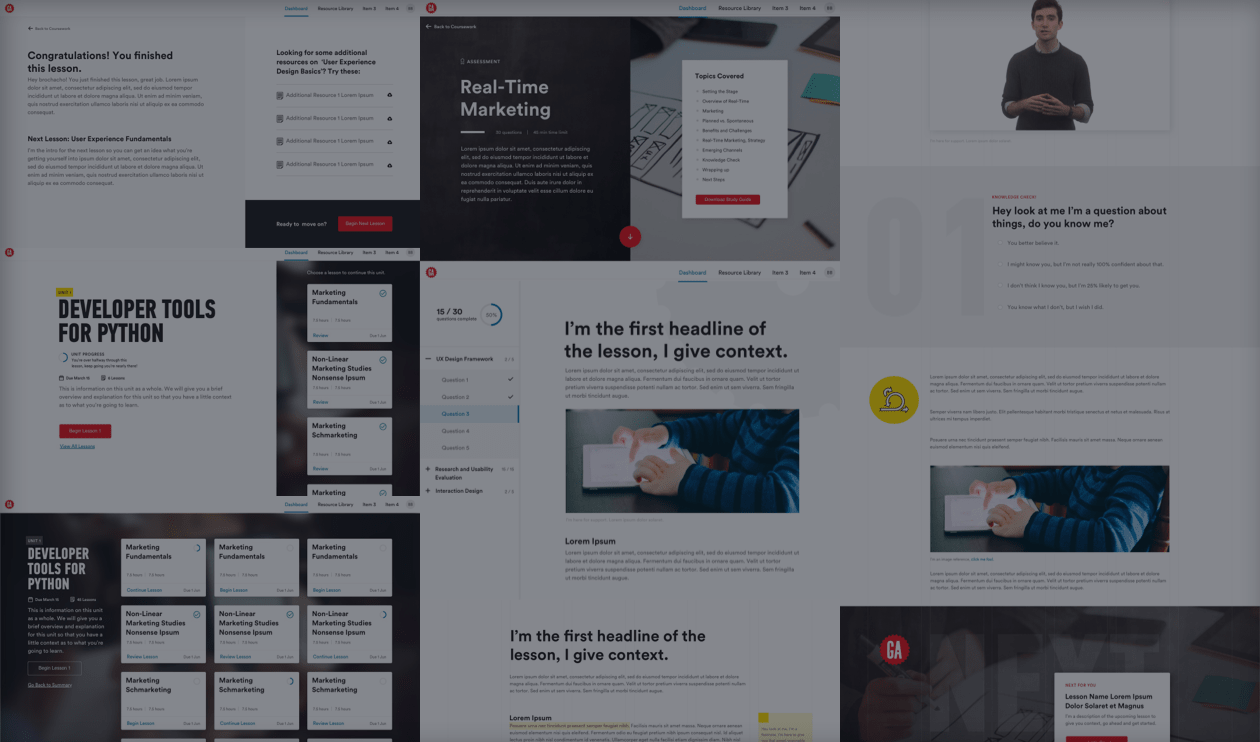
Next Lesson Flow
Next Lesson Flow
Next Lesson Flow
Updates to the lesson flow and the addition of a learning path overview page would provide opportunities to implement our new design principles in a way that would provide users with a more visual and dynamic learning experience designed to guide them forward.
While working on the brand structure, creating all the rules around motion, photography, and use of brand elements within the online platform I was working on a parallel path with UX designers to reinvision the lesson structure and implement a new sidebar navigation. Up until this point there were different types of learning paths that would behave differently, in this act we would improve the overall lesson flow/user experience while creating one uniform function of the learning platform. This would take all the ideas and improvements I had been working towards and put them to use.
While working on the brand structure, creating all the rules around motion, photography, and use of brand elements within the online platform I was working on a parallel path with UX designers to reinvision the lesson structure and implement a new sidebar navigation. Up until this point there were different types of learning paths that would behave differently, in this act we would improve the overall lesson flow/user experience while creating one uniform function of the learning platform. This would take all the ideas and improvements I had been working towards and put them to use.
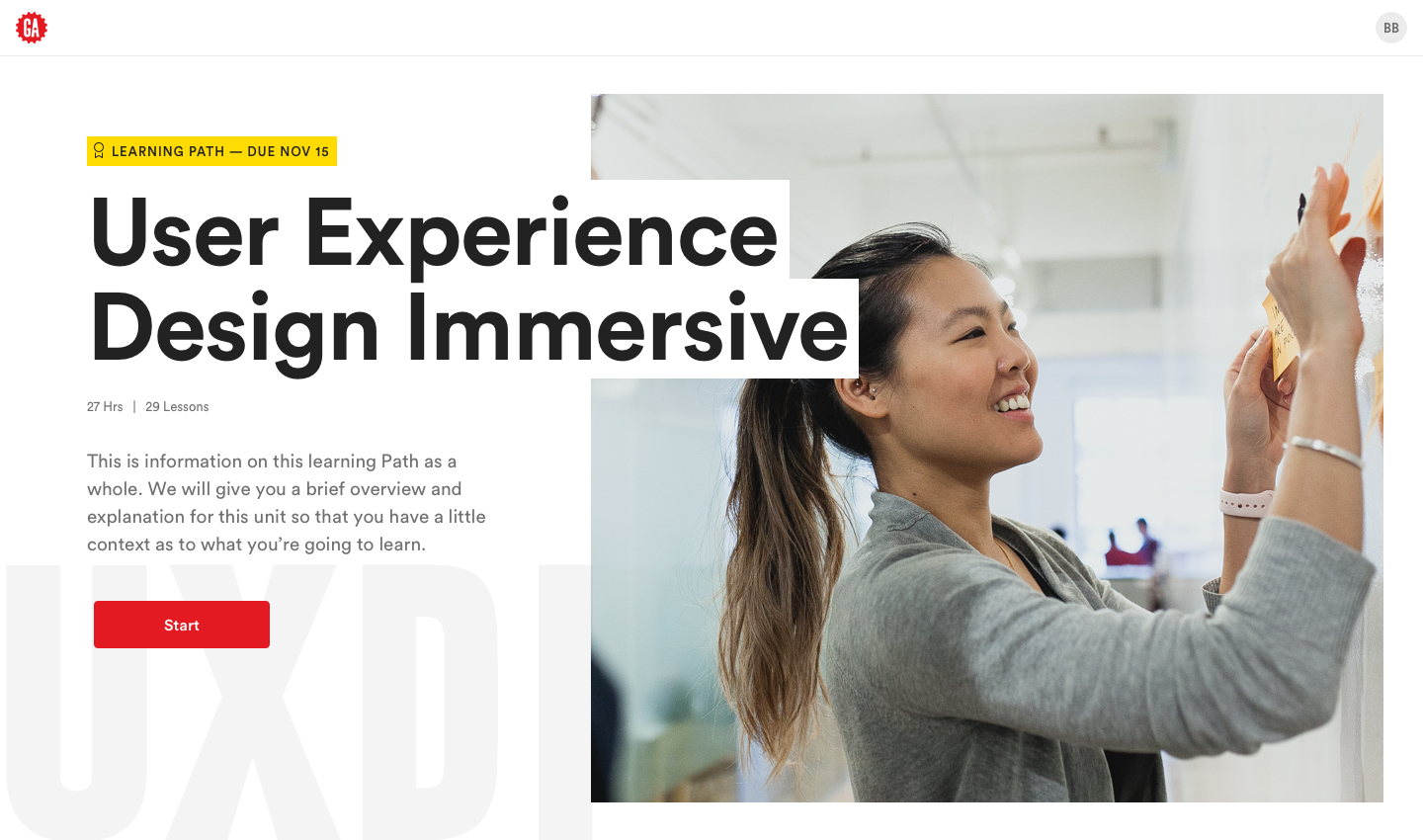
Unit Overview: This page was one of the most focused on over the course of the explore, it recieved a much more graphic layout and typographic treatment. This page serves as the first introduction to an entire learning path, the front bookend to the entire experience.
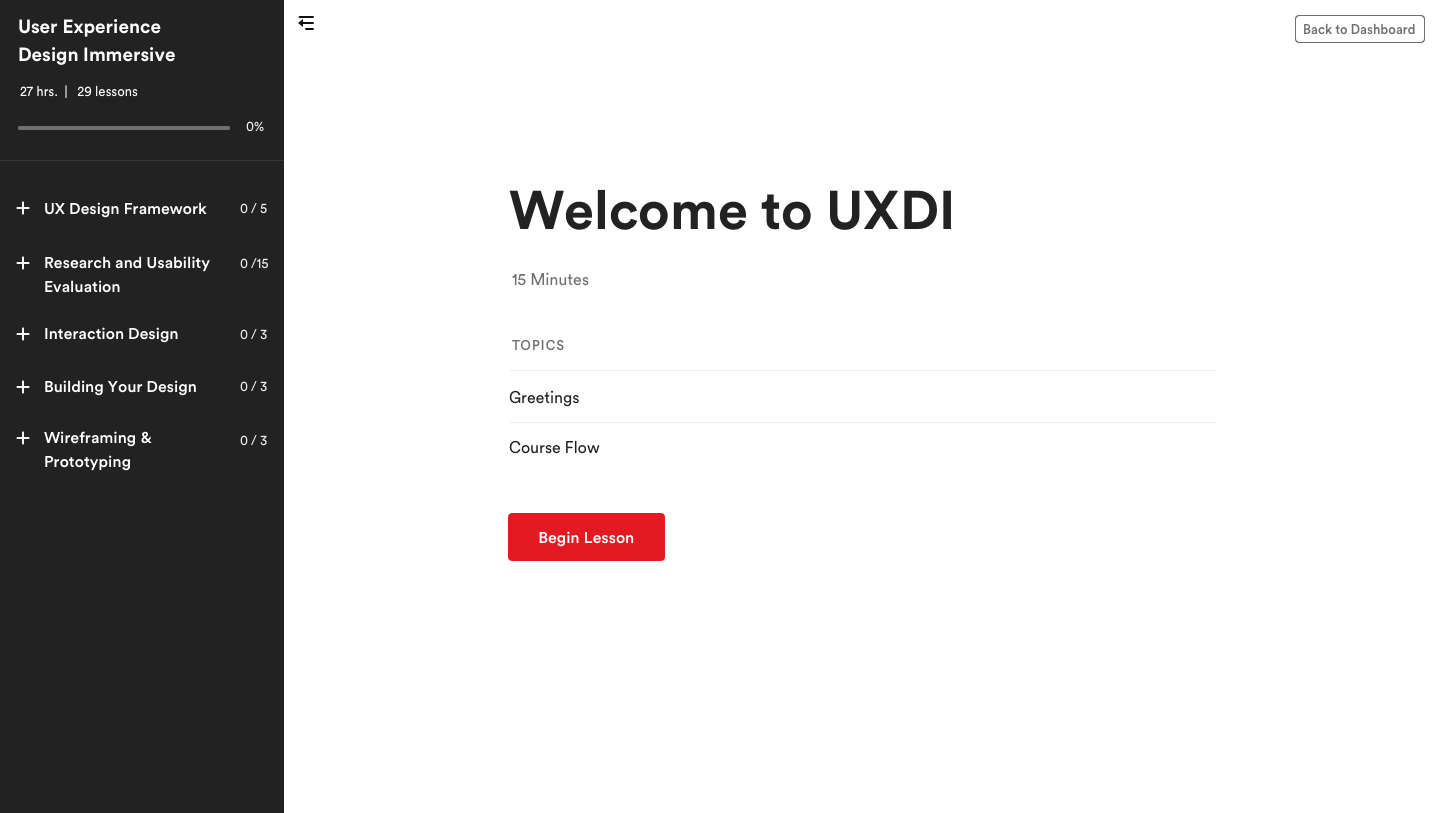
Lesson Introduction: This page internally did not see any design updates, it is however the first section within the learning path where users are first introduced to the sidebar navigation.
Lesson Content Slide: These slides were minorly updated, but the small changes went a long way to improve the lesson navigation. Page numbers were introduced as a replacement for a horizontal progress bar that conflicted with the overall progress across sections. Arrow navigation was given UI animation and the "Back to Dashboard" button was introduced as an escape hatch to get users out of lessons easily. The lesson experience went from an open experience to a full screen update to keep users more focused on their current lessons.
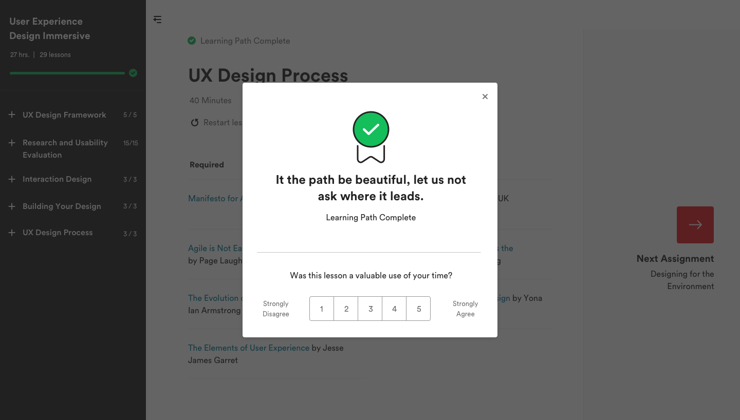
Lesson End Experience: Previously the lesson end experience for users was a congratulatory slide at the end of the lesson, a prompt to rate the lesson, then a lesson summary. The new lesson end experience combines the congratulatory moment with the rating to offer users a more personalized congratulations without impacting the ability to capture data.
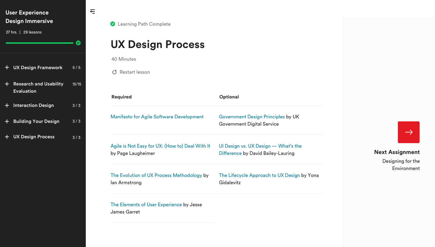
Lesson Summary: The most significant update to the end of lesson/end of learning path design was the introduction of the "Next Assignment" panel on the right. Previously the user would have to exit to the dashboard to continue to another learning path or assessment, with this design they could seamlessly move on to the next lesson, and if they completed all lessons in a path, they could move to the next most urgent assignment.
Credits
Experience
Credits
Credits
This project couldn't have been accomplished solo, here's all the key players.
Graduated with top portfolio nominations and a Bachelor of Fine Arts degree in Communication Design.
This project couldn't have been accomplished solo, here's all the key players.