Acuvue
Acuvue
Acuvue
Acuvue
Acuvue
UI / UX, Branding
UI / UX, Branding
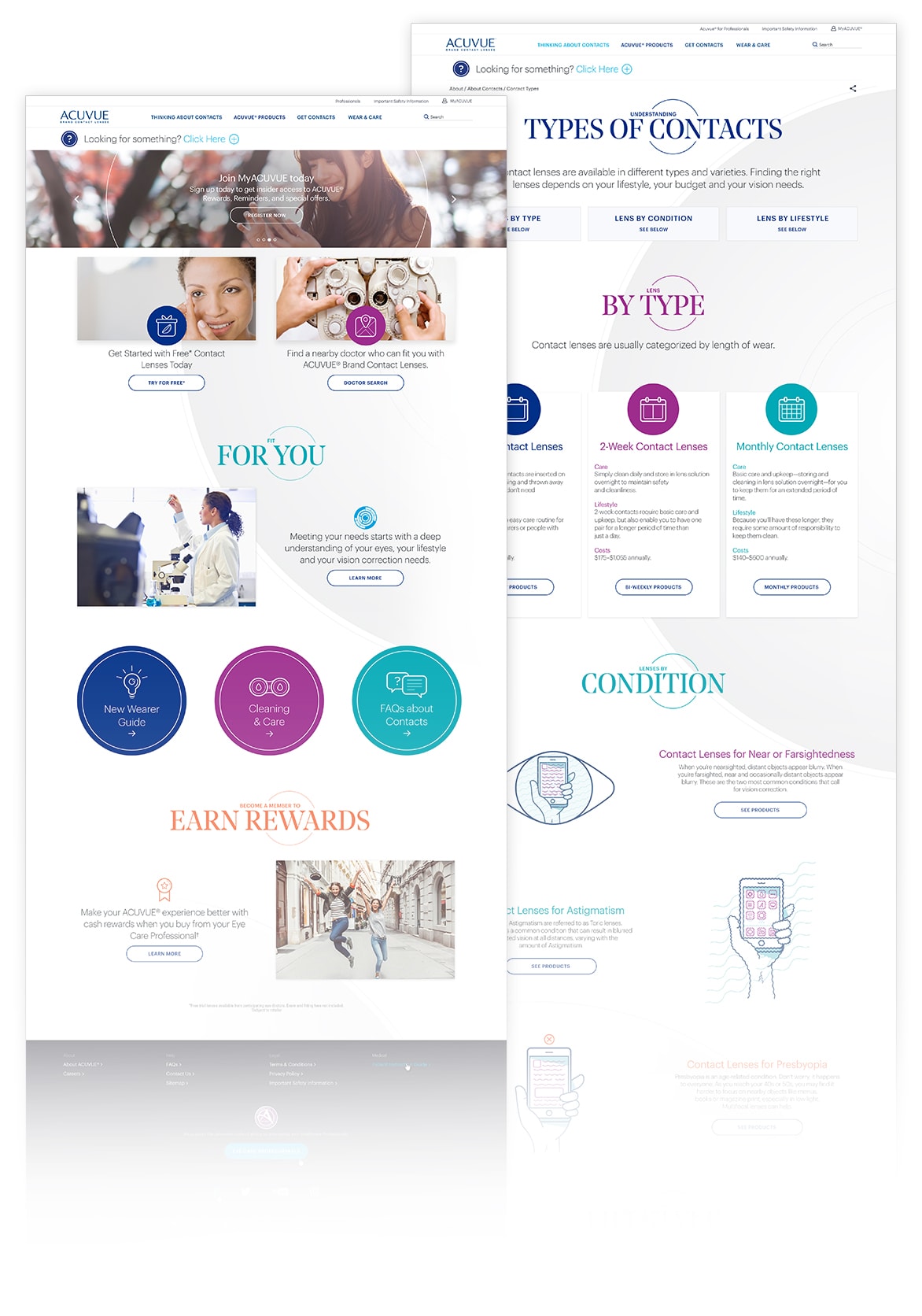
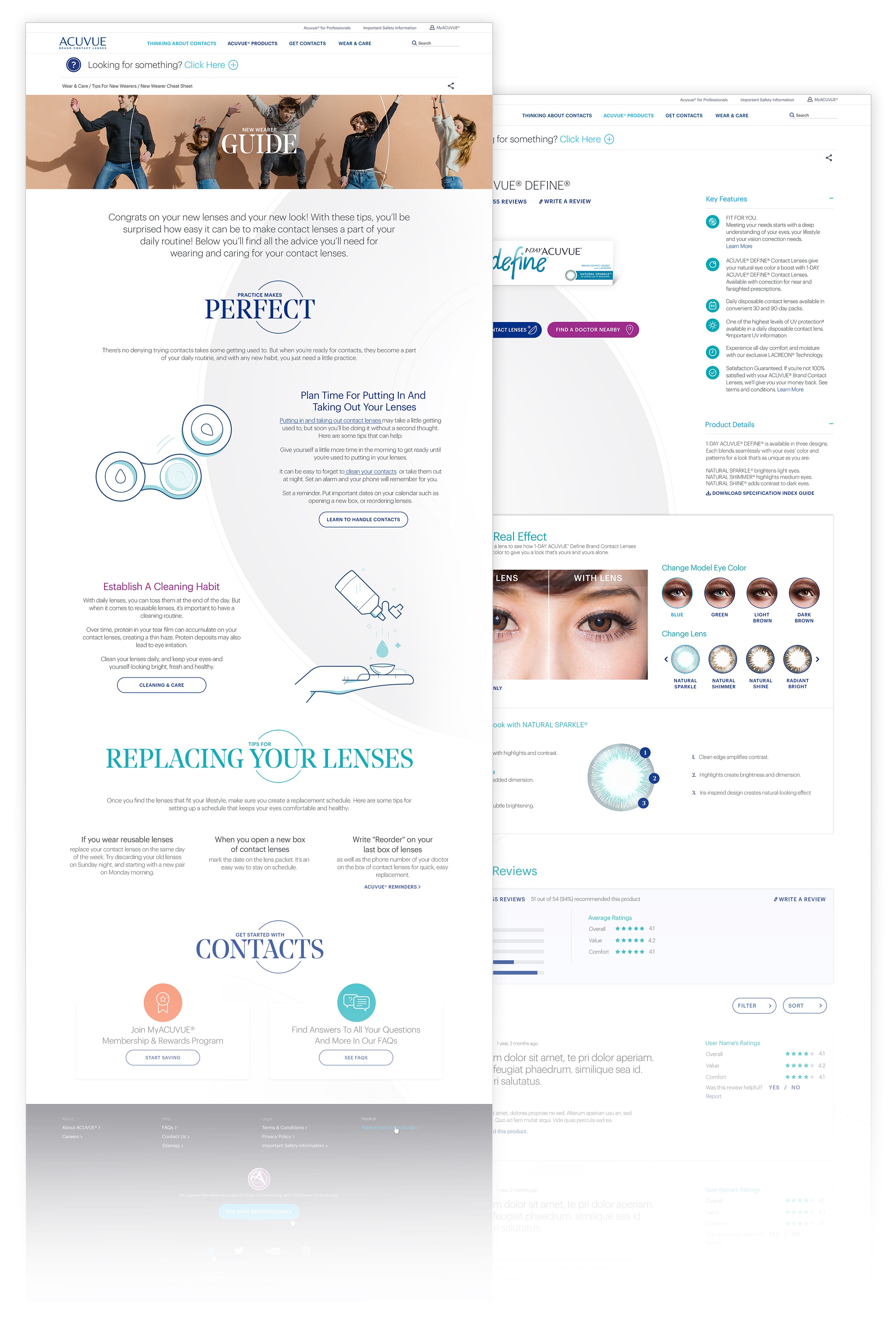
Acuvue wanted to change their look and completely redesign their website to appeal to a younger market. The site at the time was over ten years old and didn't stand out from the competition. So we created a vibrant new look that would make them the visual brand on the market, made their content informative and easy to access, and set the standard for their competition.
Roles
Roles
Primary visual designer — I started working with Acuvue at the pitch phase and kept going through to launch. I was responsible for the brand look and feel, illustration, iconography, QA, photography, etc.
Design Timeline
1
Strategy
With a brand as large as Acuvue, the strategy and pitch phase of this project took a while. In this step, we developed a content system that would ensure that content was always broken down into manageable amounts, we planned how content would be delivered to users that needed it, and concepted visual styles that would help to inform while feeling credible but not stiff.
2
Creating a System
Once we had designed our content strategy it was time to design our content. I developed an illustration style for both icons and more detailed illustrations, established new rules around typography, photography, and color. Then we began building pages and trying to break our system, updating and improving upon it.
3
Implement
The new Acuvue.com would be a massive launch, we would need to be mobile friendly, accessible, visual but not distracting. Our new brand launch needed to balance the personality of a fashion brand with the credibility of a medical brand. We launched the new Acuvue.com with over 40 pages of new content.
Branding
Site Design
Site Design
Branding
Color & Typography
Color & Typography
Noe Display offers a fashionable and crisp look that pairs well with the simple geometric Graphik.
Noe Display offers a fashionable and crisp look that pairs well with the simple geometric Graphik.
Noe Display offers a fashionable and crisp look that pairs well with the simple geometric Graphik.


Headline Typeface


Subhead / Body Text Typeface


Photography
Photography
Photography
Being limited to stock doesn't mean a lack of quality. We would focus on a range of subjects and keep the styling more warm and approachable instead of clinical.
Being limited to stock doesn't mean a lack of quality. We would focus on a range of subjects and keep the styling more warm and approachable instead of clinical.
Being limited to stock doesn't mean a lack of quality. We would focus on a range of subjects and keep the styling more warm and approachable instead of clinical.


Iconography
Iconography
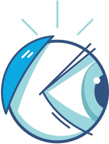
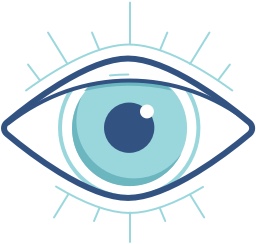
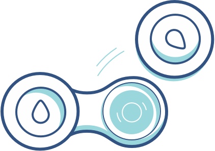
Illustration
Illustration
Illustration
When working on instructional illustrations it's important to make sure you're very literal, but especially with the eye being the main subject it's also important to not be off-putting.
When working on instructional illustrations it's important to make sure you're very literal, but especially with the eye being the main subject it's also important to not be off-putting.
When working on instructional illustrations it's important to make sure you're very literal, but especially with the eye being the main subject it's also important to not be off-putting.
When working on instructional illustrations it's important to make sure you're very literal, but especially with the eye being the main subject it's also important to not be off-putting.
When working on instructional illustrations it's important to make sure you're very literal, but especially with the eye being the main subject it's also important to not be off-putting.
How it Came Together
Site Design
Site Design
End Design
Credits
Credits
Credits
Credits
This project couldn't have been accomplished solo, here's all the key players.
Graduated with top portfolio nominations and a Bachelor of Fine Arts degree in Communication Design.
This project couldn't have been accomplished solo, here's all the key players.